Utilize full available screen space in a Zendesk sidebar app, both width and height | Community
Skip to main content

Utilize full available screen space in a Zendesk sidebar app, both width and height

  • June 24, 2025
  • 7 replies
  • 0 views

We've been developing a Zendesk sidebar app and want it to use the full available sidebar screen space, both in width and height. While setting the width to 100% works as expected, setting height: '100%' via

client.invoke('resize', {
   width: '100%',
   height: '100%'
});

has no effect – the height simply isn't respected unless we provide a fixed pixel value. But hardcoding a value doesn't adapt to the dynamic space available, which is essential for our app since it displays live contextual data.
 

We’ve also tried using CSS to enforce full height, including height: 100% and min-height: 100vh on the body and root elements, but that didn’t solve the issue either. We noticed that Zendesk’s own demo apps (e.g. https://github.com/zendesk/demo_apps/blob/master/v2/support/basic_ticket_sample_app/assets/iframe.html) navigate around this by setting small fixed heights, but that’s not sufficient for real-world use cases like ours.
 

We’re looking for a reliable and flexible way to make our app grow to fill the full height of the sidebar, without relying on fixed pixel values or triggering unwanted layout side effects like scrollbars or infinite resize loops. If there’s an official recommendation or a minimal working example, that would be very helpful.

Thank you!

7 replies

  • July 2, 2025
Hi Zane, 
 
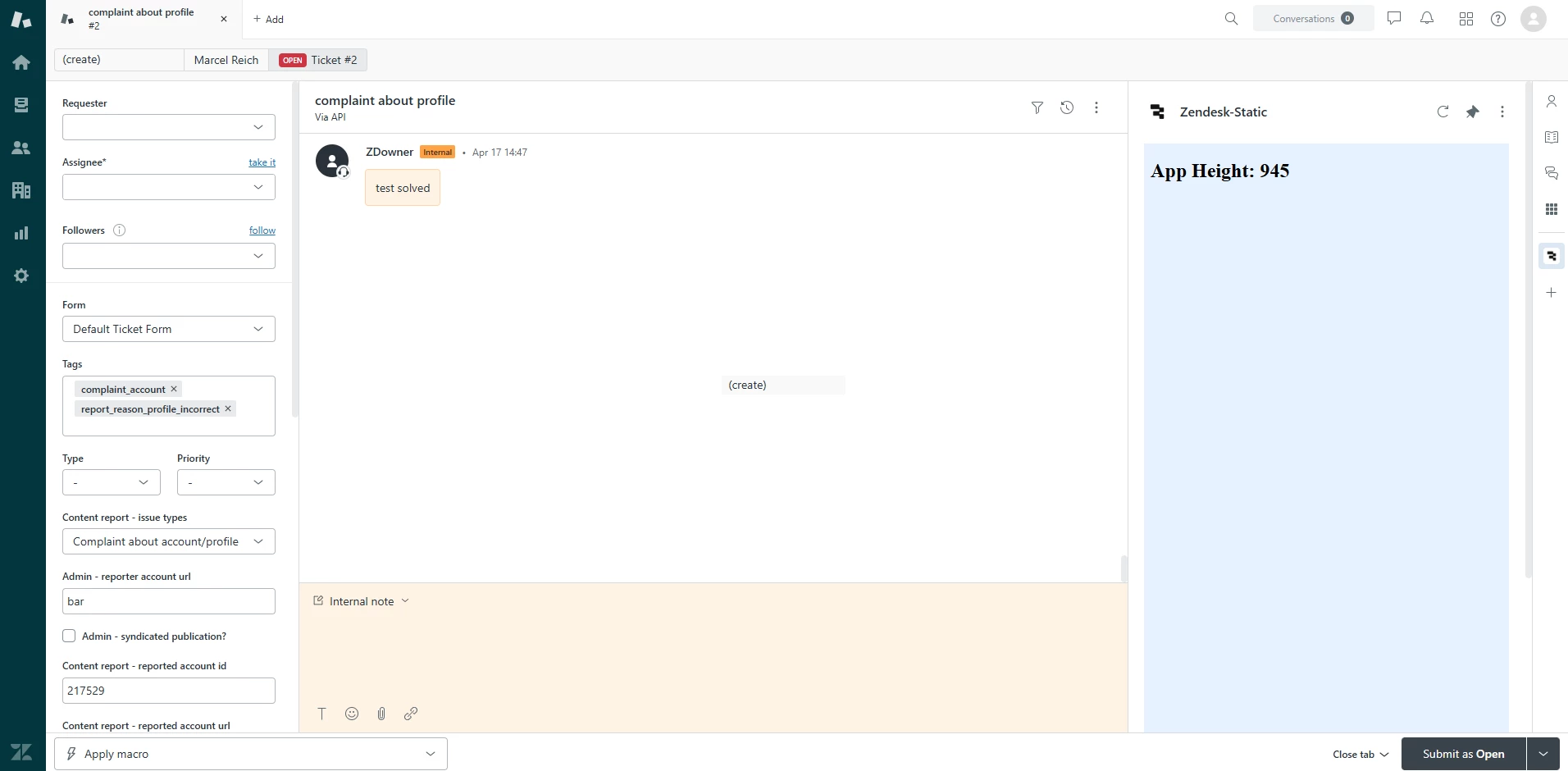
Maybe I'm misunderstanding but I was able to set 100vh for a sidebar app to fill the available space. Here is the repo of the app showcasing this. Please let me know if this isn't what you're looking for. 
 
All the best,
 
Erica - Sr. Dev Advocate

  • Author
  • July 4, 2025

Thank you for taking the time, Erica. I’ve carefully tested the code from your repo, but unfortunately it produces the same issue I described earlier. To demonstrate this more clearly, you can make two small changes to your code:


1. Add a background color to the html head so it’s easier to see how far the iframe actually extends:

<style>
 body { background-color: #e6f2ff; }
</style>

2. Extend the content by adding more text to the <h2> element:

<h2 id="windowHeight" class="u-semibold u-fs-xl">
 Longer Text Longer Text <br />
 Longer Text Longer Text <br />
 Longer Text Longer Text <br />
 Longer Text Longer Text <br />
 Longer Text Longer Text <br />
 Longer Text Longer Text <br />
 Longer Text Longer Text <br />
 Longer Text Longer Text <br />
</h2>

When you run the app with these two changes, the page appears as follows:

It seems that the app initially stops short and doesn’t expand to use the full vertical height of the sidebar.


Then, when resizinig the window, the page appears as follows:

Here again, the app doesn’t actually fill the space at 100% but instead shows a vertical scrollbar – meaning it overshoots the intended area and fails to use the available space correctly. This is exactly the problem we’re trying to solve.


We’re definitely on the right track here, and I’d really appreciate your thoughts on this specific behavior we’re seeing. Could you take a closer look at this and let us know how you’d approach solving it?


Thanks again for your support.


  • July 9, 2025
Hi Zane, 
 
Apologies for the delay. I got pulled into a project that took a lot of my time this week. Thank you for clarifying though. 
 
I'm going to take a look into this some more today and see if I can get it sorted out. 

  • Author
  • July 24, 2025

Hi Erica,

Just following up on our earlier conversation about the sidebar app height issue. I appreciate you taking the time to look into it and share your thoughts.

Have you had a chance to dig a bit deeper? We'd really appreciate any guidance when you have a moment.

Thanks again,
Zane


  • August 8, 2025
Hi Zane, 
 
Sorry for not circling back. I did some more tinkering with it but went out of office before I had a chance to find a solution. Let me get back on this and try to get you a solution this upcoming week.

Simon68
  • August 25, 2025

Hello,


Thank you Erica for providing more info on this question.


I have the same use case as Zane here where I want the Zendesk ticket sidebar app to dynamically resize and fit the height of the window.  The problem with using 100vh seems to be that it's larger than the visible space for the sidebar app.  I'm able to get around this by resizing twice – first invoking with 100vh to resize to 100% window's inner height, then fetching the new innerHeight and subtracting a fixed amount (300 seemed to fit well).  I unfortunately could not do this in a single call as ZAF client does not support calculating 100vh and subtracting a fixed amount in a single expression.


Here's my full script solution:

var client = ZAFClient.init();
let suppressResize = false;

function sleep(ms) {
    return new Promise(resolve => setTimeout(resolve, ms));
}

async function resizeApp() {
    try {
        suppressResize = true;
        await client.invoke("resize", { height: "100vh" });
        await sleep(50); // need to wait for window to finish resizing
        await client.invoke("resize", { height: `${window.innerHeight - 300}` });
        await sleep(50); // need to wait for window to finish resizing
        suppressResize = false;
        const displayHeight = document.getElementById("windowHeight");
        displayHeight.innerHTML = `App Height: ${window.innerHeight}`;
    } catch (e) {
        console.error(e);
    }
}

window.addEventListener("resize", async () => {
    if (suppressResize) {
        console.log("Suppressed resize event");
        return;
    }
    await resizeApp();
});

client.on('app.registered', async () => {
    await resizeApp();
});


This solution introduced other problems since it will trigger an infinite loop if you have a resize event listener, but I added a flag to check for automatic resizing vs user resizing and this seems to work alright. 


Ideally, using 100vh will fit perfectly in the iframe, or we can use CSS expressions like calc(100vh - 300px) to calculate the height.


This is by no means a clean or ideal solution, but it seems to work for now.  Any other suggestions or possible solutions would be greatly appreciated, ideally one that would not require 2 resize calls to client.invoke().


Thanks!

Simon


  • Author
  • September 4, 2025

It’s a bit unfortunate that for several months there hasn’t been a working solution or concluding guidance from Zendesk on this topic. However, we really appreciate that Simon, as an affected end user too, stepped in and proactively shared his workaround – that contribution has been very valuable for us in exploring new ways to handle this.

We’ve picked up on his ideas, and we want to fully acknowledge and thank him for that. Building on his approach, we experimented a bit with AI and put together some code that avoids showing a scrollbar on load and also resizes correctly after a resize event. It’s not perfect and definitely more of a workaround than a proper fix, but at least it provides a viable path until Zendesk addresses this properly.

For anyone interested, here’s the full code we ended up with:

<!DOCTYPE html>
<html>
 <head>
   <meta charset="utf-8" />
   <style>
     html, body {
       margin: 0;
       padding: 0;
       background-color: #e6f2ff;
     }
   </style>
 </head>
 <body>
   <h2 class="u-semibold u-fs-xl">
     Longer Text Longer Text <br />
     Longer Text Longer Text <br />
     Longer Text Longer Text <br />
     Longer Text Longer Text <br />
     Longer Text Longer Text <br />
     Longer Text Longer Text <br />
     Longer Text Longer Text <br />
     Longer Text Longer Text <br />
     Longer Text Longer Text <br />
     Longer Text Longer Text <br />
     Longer Text Longer Text <br />
     Longer Text Longer Text <br />
     Longer Text Longer Text <br />
     Longer Text Longer Text <br />
     Longer Text Longer Text <br />
     Longer Text Longer Text <br />
     Longer Text Longer Text <br />
     Longer Text Longer Text <br />
   </h2>
   <script src="https://static.zdassets.com/zendesk_app_framework_sdk/2.0/zaf_sdk.min.js"></script>
   <script>
     var client = ZAFClient.init();
     let suppressResize = false;
     let cooldownUntil = 0;
     const OFFSET = 250;
     function sleep(ms) { return new Promise(r => setTimeout(r, ms)); }
     const nextFrame = () => new Promise(r => requestAnimationFrame(r));
     async function waitForInnerHeightChange(maxFrames = 20) {
       const start = window.innerHeight;
       for (let i = 0; i < maxFrames; i++) {
         await nextFrame();
         if (window.innerHeight !== start) return;
       }
     }
     async function resizeApp() {
       try {
         suppressResize = true;
         cooldownUntil = Date.now() + 400;
         await client.invoke("resize", { height: "100vh" });
         await waitForInnerHeightChange();
         const target = Math.max(0, window.innerHeight - OFFSET);
         cooldownUntil = Date.now() + 400;
         await client.invoke("resize", { height: target });
         await sleep(60);
         cooldownUntil = Date.now() + 200;
         suppressResize = false;
       } catch (e) {
         suppressResize = false;
       }
     }
     window.addEventListener("resize", async () => {
       if (suppressResize) return;
       if (Date.now() < cooldownUntil) return;
       await resizeApp();
     });
     client.on('app.registered', async () => {
       await resizeApp();
     });
     client.on('activated', async () => {
       if (!suppressResize) await resizeApp();
     });
   </script>
 </body>
</html>

Hopefully this helps others facing the same problem.

Best,
Zane