How to add dropdowns/navigation to the header | Community
Skip to main content

How to add dropdowns/navigation to the header

  • February 5, 2020
  • 5 replies
  • 0 views

Since Zendesk Guide is external, I am trying to copy my website's navigation menu to the Copenhagen theme.


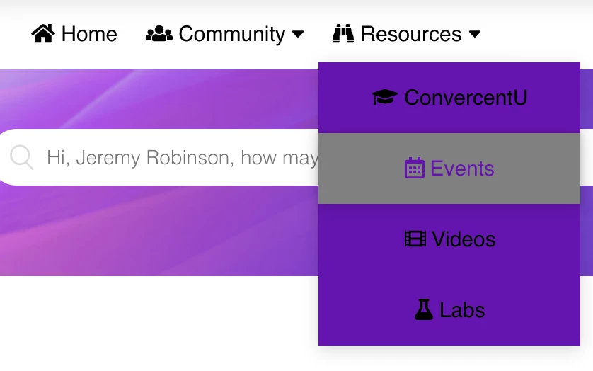
How do I add dropdowns to the header? This seems like it would be a common feature. All I seem to be able to do is put links in the header.

5 replies

Ifra
  • February 5, 2020

Hey Brian,

Please follow these steps for dropdown navigation, please add the classes carefully.

Step 1 :  Add links in the header template like this -

 <div class="main-link">
<a href="#" class="link-one">Home</a>
<div class="hidden-link">
<a href="#">Home 1</a>
<a href="#">Home 2</a>
<a href="#">Home 3</a>
</div>
</div>


Step 2 : Add this css code on your stylesheet -

.hidden-link{
display:none;
}

.link-show{
display:block;
}


Step 3 : Add this JS code on your script template at the bottom -

$(document).ready(function(){
$(".link-one").click(function(){
$(".hidden-link").toggleClass('link-show');
});
});


Please let me know if any issue :)


Thank You

Team Diziana


  • Author
  • February 5, 2020

Unfortunately, nothing happens when I mouse over the first link. No dropdown menu or links appear.


  • February 5, 2020

378777086274 I believe what you are looking for is this type of view and functionality:


If this is what you are after, below is the code I have implemented to get this, where you can edit the HTML and CSS as needed.

**There are some li class=manager areas of the HTML code that you DO NOT need and can leave out on your end, I added this in our environment as we have some items we only want visible to managers**


HTML(this goes into the header.hbs file):

<header class="header-wrapper">
<div class="header">

<div class="logo">
{{#link 'help_center'}}
<img src="{{settings.logo}}" alt="{{t 'logo'}}"> {{/link}}
</div>
<div class="nav-container">
<navs class="center">
<div class="nav-mobile"><a id="nav-toggle" href="#!"><span></span></a></div>
<ul class="nav-list">
<li><a href="#"><i class="fas fa-home"></i> Home</a></li>

<li><a href="#"><i class="fas fa-users"></i> Community <i class="fa fa-caret-down"></i></a>
<ul class="nav-dropdown">
<li><a href="#"><i class="fas fa-users"></i> Convercent Community</a></li>
<!-- <li class="manager"><a href="#"><i class="fas fa-users"></i> Converge Community</a></li> -->
<li class="manager nyu"><a href="#"><img src="{{asset 'NYULogo.png'}}" width=70px> <BR>Community</a></li>
</ul>
</li>
<li><a href="#"><i class="fas fa-binoculars"></i> Resources <i class="fa fa-caret-down"></i></a>
<ul class="nav-dropdown">
<li class="manager"><a href="#"><i class="fas fa-graduation-cap"></i> ConvercentU</a></li>
<li><a href="#"><i class="far fa-calendar-alt"></i> Events</a></li>
<li><a href="#"><i class="fas fa-film"></i> Videos</a></li>
<li class="manager"><a href="#"><i class="fas fa-flask"></i> Labs</a></li>
</ul>
</li>
</ul>
</navs>
</div>


CSS(place at the bottom of your style.css file):

/* Add navigation menu */
/* Outer navigation wrapper */
.navigation {
height: 40px;
text-align: center;
}

/* Container with no padding for navbar */
.nav-container {
max-width: 1000px;
margin: 0 auto;
}

/* Navigation */
navs {
float: left;
text-align: center;
}

navs ul {
background-color: #6415AD;
list-style: none;
margin: 0;
padding: 0;
}

navs ul li {
float: left;
position: relative;
}

navs ul li a, navs ul li a:visited {
display: block;
padding: 0 10px;
line-height: 40px;
opacity: 100%;
color: black;
text-decoration: none;
}

navs ul li a:hover, navs ul li a:visited:hover {
background: gray;
color: #6415AD;
box-shadow: 0 0 4px 0 rgba(0, 0, 0, 0.15), 0 4px 10px 0 rgba(0, 0, 0, 0.1);
box-sizing: border-box;
}

navs ul li ul li {
min-width: 185px;
}

navs ul li ul li a {
padding: 15px;
line-height: 20px;
text-align: center;
}

.nav-dropdown {
position: absolute;
display: none;
z-index: 1;
box-shadow: 0 3px 12px rgba(0, 0, 0, 0.15);
}

/* Mobile navigation */
.nav-mobile {
display: none;
position: absolute;
top: 190px;
right: 0px;
background: white;
height: 50px;
width: 70px;
}

@media only screen and (max-width: 768px) {
.nav-mobile {
display: block;
background-color: #6415AD;
}
navs {
width: 100%;
}
navs ul {
display: none;
background: #6415AD;
}
navs ul li {
float: none;
}

.anonymous,
.end_user,
.agent,
.manager  {
display: none;
}

navs ul li a {
padding: 15px;
line-height: 20px;
}
navs ul li ul li a {
padding-left: 30px;
}
.nav-dropdown {
position: relative;
}
}
@media screen and (min-width: 768px) {
.nav-list {
display: block;
}
}
#nav-toggle {
position: absolute;
left: 18px;
top: 12px;
cursor: pointer;
padding: 10px 0px 10px 0px;
}
#nav-toggle span, #nav-toggle span:before, #nav-toggle span:after {
cursor: pointer;
border-radius: 1px;
height: 5px;
width: 40px;
background: white;
position: absolute;
display: block;
content: "";
transition: all 300ms ease-in-out;
}
#nav-toggle span:before {
top: -10px;
}
#nav-toggle span:after {
bottom: -10px;
}
#nav-toggle.active span {
background-color: transparent;
}
#nav-toggle.active span:before, #nav-toggle.active span:after {
top: 0;
z-index: 2;
}
#nav-toggle.active span:before {
transform: rotate(45deg);
}
#nav-toggle.active span:after {
transform: rotate(-45deg);
}

JS (this goes in your script.js file, BEFORE the document ready function):

//Toggles arrows and content in the navigation menu
(function($) {
$(function() {
//
$('navs ul li a:not(:only-child)').click(function(e) {
$(this).siblings('.nav-dropdown').toggle();
// Close one dropdown when selecting another
$('.nav-dropdown').not($(this).siblings()).hide();
e.stopPropagation();
});
// Clicking away from dropdown will remove the dropdown class
$('html').click(function() {
$('.nav-dropdown').hide();
});
// Toggle open and close nav styles on click
$('#nav-toggle').click(function() {
$('navs ul').slideToggle();
});
// Hamburger to X toggle
$('#nav-toggle').on('click', function() {
this.classList.toggle('active');
});
});
})(jQuery);


Ifra
  • February 6, 2020

Hey Brian ,

You need click on the link then dropdown menu would be open.

Thank You


  • Author
  • February 6, 2020

Thanks everyone for your help! I found the easiest way was to delete the whole navigation and use Bootstrap CSS and HTML. It made looking up documentation a lot faster.