
Hi there.
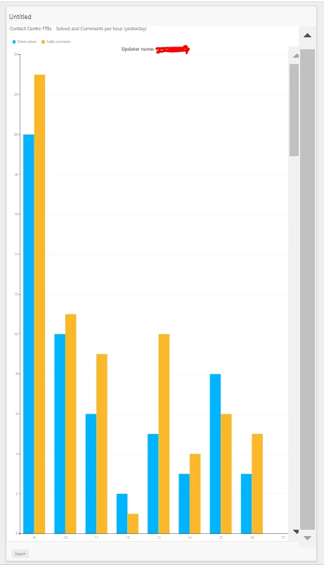
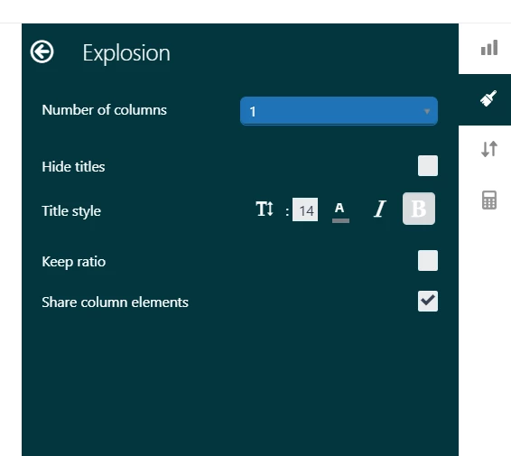
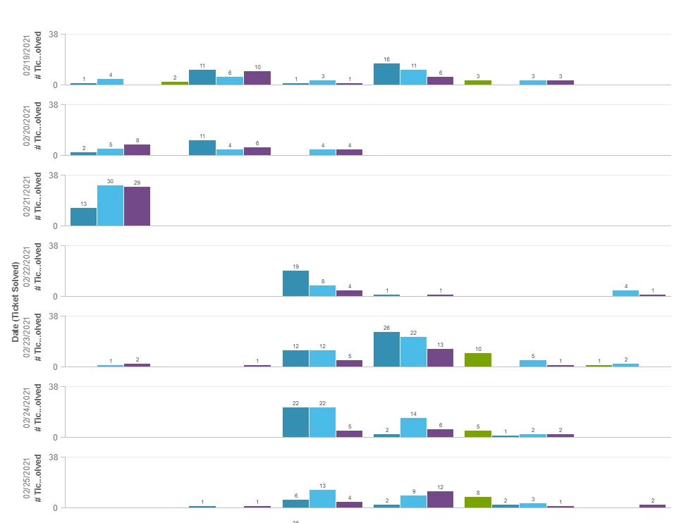
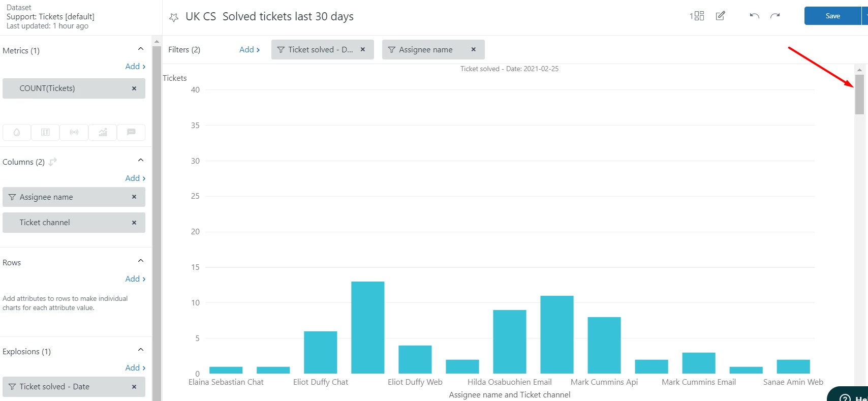
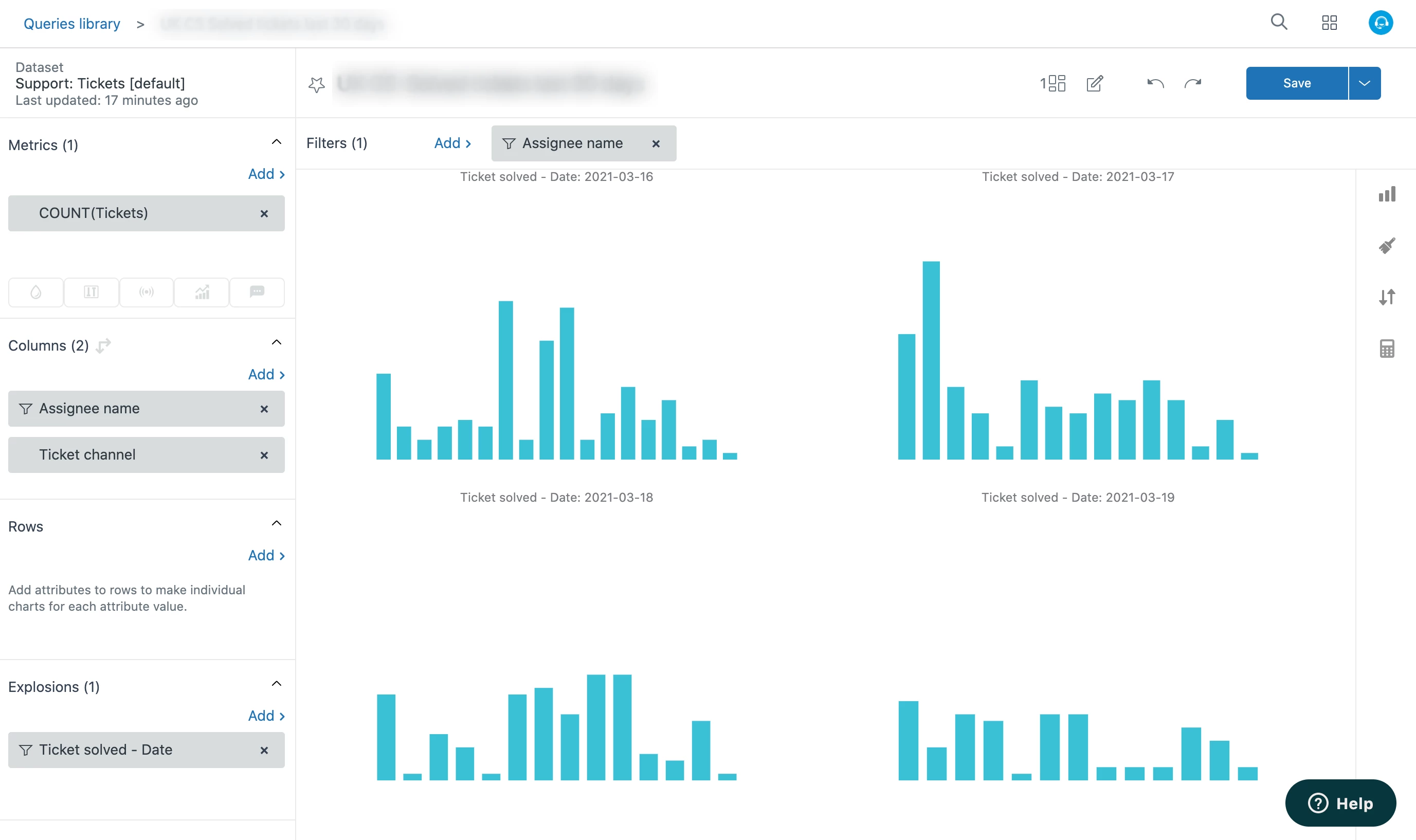
I created an exploded chart that shows the activity per hour of a certain number of assignees. It was exactly how I wanted it so I was happy to add it to my dashboard. However, once on the dashboard, when I try to increase the size of my query (to avoid having the scroll down arrow), every time I drag the query down it continues to only show the top chart of my explosion. I got to a point where I have an entire dashboard with a single huge columns chart. How can I adjust it so that I can expand the size of the whole query, not just the top chart?
I zoomed out of my browser to be able to take this screenshot, to give you a better idea of my issue:
Any help would be most appreciated.
 I understand you wanted to change the length of the Y axis, thing not possible at the moment, I hope this helps :)
Hey Diego,
We will need to take a look at the specific report you referenced so I'll create a ticket on your behalf so we can dig into this further.
Cheers!