Changing columns to rows on Categories pages | Community
Skip to main content

Changing columns to rows on Categories pages

  • October 14, 2021
  • 6 replies
  • 0 views

Hi, 

At the moment we have columns on our categories pages that link to the sections based on our different products.  see image below:

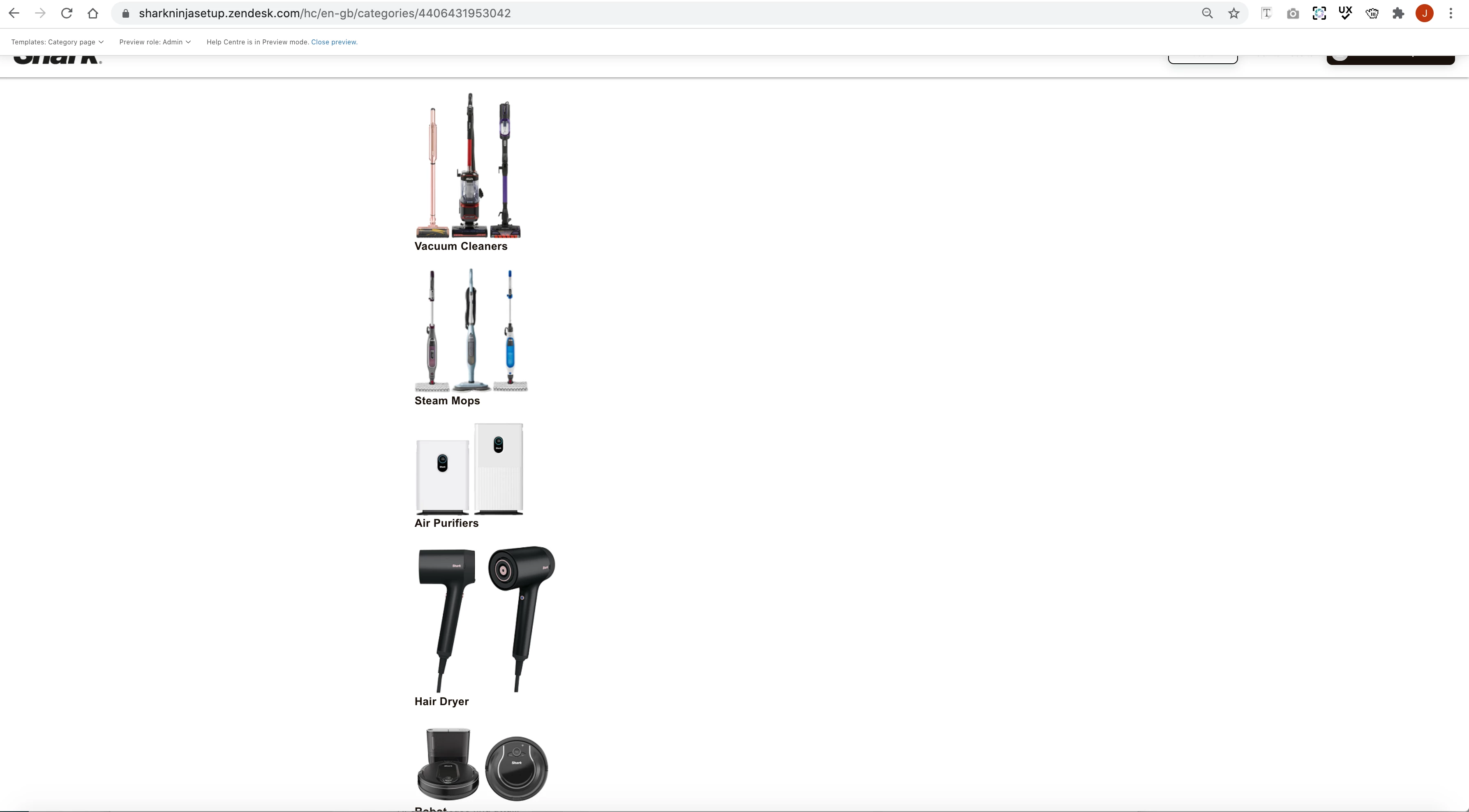
How do I turn these into a row structure?  I have looked over the code and i can't seem to see where to edit.  

Thanks, 

6 replies

Tipene
  • October 14, 2021

Hi Jessica,

Would you mind sending me the relevant CSS so I can take a look at how this is currently structured?

Thanks!

Tipene


  • Author
  • October 15, 2021

Hi Tipene,

Here is some of the css code related to the columns.  We have nearly 6300 lines of css I hope I have sent the right part.  i will also provide you with the html on the categories page so you can see the set up.

CSS code

.row {
margin-right: calc(15px * -1);
margin-left: calc(15px * -1);
}

/* COLUMN CUSTOMIZATION */

.column {
position: relative;
float: left;
width: 100%;
min-height: 1px;
padding-right: 15px;
padding-left: 15px;
margin-top: 10px;
}

.column--xs-1 {
width: 8.33333%;
}

.column--xs-2 {
width: 16.66667%;
}

.column--xs-3 {
width: 25%;
}

.column--xs-4 {
width: 33.33333%;
}

.column--xs-5 {
width: 41.66667%;
}

.column--xs-6 {
width: 50%;
}

.column--xs-7 {
width: 58.33333%;
}

.column--xs-8 {
width: 66.66667%;
}

.column--xs-9 {
width: 75%;
}

.column--xs-10 {
width: 83.33333%;
}

.column--xs-11 {
width: 91.66667%;
}

.column--xs-12 {
width: 100%;
}

.column--xs-offset-0 {
margin-left: 0%;
}

.column--xs-offset-1 {
margin-left: 8.33333%;
}

.column--xs-offset-2 {
margin-left: 16.66667%;
}

.column--xs-offset-3 {
margin-left: 25%;
}

.column--xs-offset-4 {
margin-left: 33.33333%;
}

.column--xs-offset-5 {
margin-left: 41.66667%;
}

.column--xs-offset-6 {
margin-left: 50%;
}

.column--xs-offset-7 {
margin-left: 58.33333%;
}

.column--xs-offset-8 {
margin-left: 66.66667%;
}

.column--xs-offset-9 {
margin-left: 75%;
}

.column--xs-offset-10 {
margin-left: 83.33333%;
}

.column--xs-offset-11 {
margin-left: 91.66667%;
}

.column--xs-offset-12 {
margin-left: 100%;
}

@media (min-width: 769px) {
.column--sm-1 {
width: 8.33333%;
}
.column--sm-2 {
width: 16.66667%;
}
.column--sm-3 {
width: 25%;
}
.column--sm-4 {
width: 33.33333%;
}
.column--sm-5 {
width: 41.66667%;
}
.column--sm-6 {
width: 50%;
}
.column--sm-7 {
width: 58.33333%;
}
.column--sm-8 {
width: 66.66667%;
}
.column--sm-9 {
width: 75%;
}
.column--sm-10 {
width: 83.33333%;
}
.column--sm-11 {
width: 91.66667%;
}
.column--sm-12 {
width: 100%;
}
.column--sm-offset-0 {
margin-left: 0%;
}
.column--sm-offset-1 {
margin-left: 8.33333%;
}
.column--sm-offset-2 {
margin-left: 16.66667%;
}
.column--sm-offset-3 {
margin-left: 25%;
}
.column--sm-offset-4 {
margin-left: 33.33333%;
}
.column--sm-offset-5 {
margin-left: 41.66667%;
}
.column--sm-offset-6 {
margin-left: 50%;
}
.column--sm-offset-7 {
margin-left: 58.33333%;
}
.column--sm-offset-8 {
margin-left: 66.66667%;
}
.column--sm-offset-9 {
margin-left: 75%;
}
.column--sm-offset-10 {
margin-left: 83.33333%;
}
.column--sm-offset-11 {
margin-left: 91.66667%;
}
.column--sm-offset-12 {
margin-left: 100%;
}
}

@media (min-width: 992px) {
.column--md-1 {
width: 8.33333%;
}
.column--md-2 {
width: 16.66667%;
}
.column--md-3 {
width: 25%;
}
.column--md-4 {
width: 33.33333%;
}
.column--md-5 {
width: 41.66667%;
}
.column--md-6 {
width: 50%;
}
.column--md-7 {
width: 58.33333%;
}
.column--md-8 {
width: 66.66667%;
}
.column--md-9 {
width: 75%;
}
.column--md-10 {
width: 83.33333%;
}
.column--md-11 {
width: 91.66667%;
}
.column--md-12 {
width: 100%;
}
.column--md-offset-1 {
margin-left: 8.33333%;
}
.column--md-offset-2 {
margin-left: 16.66667%;
}
.column--md-offset-3 {
margin-left: 25%;
}
.column--md-offset-4 {
margin-left: 33.33333%;
}
.column--md-offset-5 {
margin-left: 41.66667%;
}
.column--md-offset-6 {
margin-left: 50%;
}
.column--md-offset-7 {
margin-left: 58.33333%;
}
.column--md-offset-8 {
margin-left: 66.66667%;
}
.column--md-offset-9 {
margin-left: 75%;
}
.column--md-offset-10 {
margin-left: 83.33333%;
}
.column--md-offset-11 {
margin-left: 91.66667%;
}
.column--md-offset-12 {
margin-left: 100%;
}
}

@media (min-width: 1200px) {
.column--lg-1 {
width: 8.33333%;
}
.column--lg-2 {
width: 16.66667%;
}
.column--lg-3 {
width: 25%;
}
.column--lg-4 {
width: 33.33333%;
}
.column--lg-5 {
width: 41.66667%;
}
.column--lg-6 {
width: 50%;
}
.column--lg-7 {
width: 58.33333%;
}
.column--lg-8 {
width: 66.66667%;
}
.column--lg-9 {
width: 75%;
}
.column--lg-10 {
width: 83.33333%;
}
.column--lg-11 {
width: 91.66667%;
}
.column--lg-12 {
width: 100%;
}
.column--lg-pull-0 {
right: auto;
}
.column--lg-pull-1 {
right: 8.33333%;
}
.column--lg-pull-2 {
right: 16.66667%;
}
.column--lg-pull-3 {
right: 25%;
}
.column--lg-pull-4 {
right: 33.33333%;
}
.column--lg-pull-5 {
right: 41.66667%;
}
.column--lg-pull-6 {
right: 50%;
}
.column--lg-pull-7 {
right: 58.33333%;
}
.column--lg-pull-8 {
right: 66.66667%;
}
.column--lg-pull-9 {
right: 75%;
}
.column--lg-pull-10 {
right: 83.33333%;
}
.column--lg-pull-11 {
right: 91.66667%;
}
.column--lg-pull-12 {
right: 100%;
}
.column--lg-push-0 {
left: auto;
}
.column--lg-push-1 {
left: 8.33333%;
}
.column--lg-push-2 {
left: 16.66667%;
}
.column--lg-push-3 {
left: 25%;
}
.column--lg-push-4 {
left: 33.33333%;
}
.column--lg-push-5 {
left: 41.66667%;
}
.column--lg-push-6 {
left: 50%;
}
.column--lg-push-7 {
left: 58.33333%;
}
.column--lg-push-8 {
left: 66.66667%;
}
.column--lg-push-9 {
left: 75%;
}
.column--lg-push-10 {
left: 83.33333%;
}
.column--lg-push-11 {
left: 91.66667%;
}
.column--lg-push-12 {
left: 100%;
}
.column--lg-offset-0 {
margin-left: 0%;
}
.column--lg-offset-1 {
margin-left: 8.33333%;
}
.column--lg-offset-2 {
margin-left: 16.66667%;
}
.column--lg-offset-3 {
margin-left: 25%;
}
.column--lg-offset-4 {
margin-left: 33.33333%;
}
.column--lg-offset-5 {
margin-left: 41.66667%;
}
.column--lg-offset-6 {
margin-left: 50%;
}
.column--lg-offset-7 {
margin-left: 58.33333%;
}
.column--lg-offset-8 {
margin-left: 66.66667%;
}
.column--lg-offset-9 {
margin-left: 75%;
}
.column--lg-offset-10 {
margin-left: 83.33333%;
}
.column--lg-offset-11 {
margin-left: 91.66667%;
}
.column--lg-offset-12 {
margin-left: 100%;
}
}

/* END OF COLUMN CUSTOMIZATION */


HTML CODE

<script>$('#site-header').show();</script>
<div class="banner">
<div class="banner-container">
<h1 class="banner-title">{{category.name}}</h1>
<p class="banner-desc">{{category.description}}</p>
</div>
</div>
<div class="container category-page py-6">
<div class="container-inner">
<div class="site-header">
{{breadcrumbs}}
</div>
{{#if sections}}
<div class="article-lists">
<ul>
{{#each sections}}
<li>
{{#is name 'Vacuum Cleaners'}}<img class="product-thumbnail" src="{{asset 'VacuumCleanerss.png'}}">{{/is}}
{{#is name 'Steam Mops'}}<img class="product-thumbnail" src="{{asset 'SteamMopss.png'}}">{{/is}}
{{#is name 'Air Purifiers'}}<img class="product-thumbnail" src="{{asset 'airpurii.png'}}">{{/is}}
{{#is name 'Robot'}}<img class="product-thumbnail" src="{{asset 'robot.png'}}">{{/is}}
{{#is name 'AZ910 Series'}}<img class="product-thumbnail" src="{{asset 'az950uk.jpg'}}">{{/is}}
{{#is name 'AZ950 Series'}}<img class="product-thumbnail" src="{{asset 'az910uk.jpg'}}">{{/is}}
{{#is name 'NZ801 Series'}}<img class="product-thumbnail" src="{{asset 'nz801uk.jpg'}}">{{/is}}
{{#is name 'Delivery'}}<img class="product-thumbnail" src="{{asset 'Trackorderr.jpg'}}">{{/is}}
{{#is name 'Hair Dryer'}}<img class="product-thumbnail" src="{{asset 'sharkbeauty.png'}}">{{/is}}

<h4><a class="section__title-link" href="{{url}}">{{name}}</a></h4>
</li>
{{#if articles}}
<ul class="">
{{#each articles}}
<li>
<a href="{{url}}">
{{#if promoted}}
<span class="fa fa-star" title="{{t 'promoted'}}"></span>
{{/if}}
{{title}}
</a>
</li>
{{/each}}
{{#if more_articles}}
<a href="{{url}}" class="see-all-articles">
{{t 'show_all_articles' count=article_count}}
</a>
{{/if}}
</ul>
{{/if}}
{{/each}}
</ul>
</div>
</div>
{{/if}}
</div>
</div>
</div>


Tipene
  • October 18, 2021

Thanks for sending this through, Jessica.

It doesn’t look like there are any classes attached to the ul or li tags containing the images so they would be using default styling.

I had a browse through the CSS for this particular theme you’re using and I couldn’t see any styles specifically for a row structure, but there were a couple of classes that could produce the outcome you’re looking for.

To start with, can you try adding a class of “site-wrapper” to the ul containing the images, and then adding a class of “site-block” to the li containing the images.


<ul class=“site-wrapper”>
{{#each sections}}
<li class=“site-block”>
{{#is name 'Vacuum Cleaners'}}<img class="product-thumbnail" src="{{asset 'VacuumCleanerss.png'}}">{{/is}}
{{#is name 'Steam Mops'}}<img class="product-thumbnail" src="{{asset 'SteamMopss.png'}}">{{/is}}
{{#is name 'Air Purifiers'}}<img class="product-thumbnail" src="{{asset 'airpurii.png'}}">{{/is}}
{{#is name 'Robot'}}<img class="product-thumbnail" src="{{asset 'robot.png'}}">{{/is}}
{{#is name 'AZ910 Series'}}<img class="product-thumbnail" src="{{asset 'az950uk.jpg'}}">{{/is}}
{{#is name 'AZ950 Series'}}<img class="product-thumbnail" src="{{asset 'az910uk.jpg'}}">{{/is}}
{{#is name 'NZ801 Series'}}<img class="product-thumbnail" src="{{asset 'nz801uk.jpg'}}">{{/is}}
{{#is name 'Delivery'}}<img class="product-thumbnail" src="{{asset 'Trackorderr.jpg'}}">{{/is}}
{{#is name 'Hair Dryer'}}<img class="product-thumbnail" src="{{asset 'sharkbeauty.png'}}">{{/is}}

<h4><a class="section__title-link" href="{{url}}">{{name}}</a></h4>
</li>

This should produce a row with 3 images per line. We can change that if required later on.

Let me know how you go!


  • Author
  • October 18, 2021

Hi, 

Thanks for your reply back 

I have added the code to the category page and it hasn't changed it to rows unfortunately. Is there anything else that I could try? 

Thanks,

Jessica


Tipene
  • October 20, 2021

Hmm, that’s a pain. Without seeing the full CSS file on your end it’s a bit tricky to get an idea of how the styling is being applied.

Is it possible for you to copy the full CSS file into a .txt file and attach that file here so I can look into it in a bit more detail?

Thanks!

Tipene


  • Author
  • October 26, 2021

Text too long, please update