Zendesk level: Beginner
Knowledge: HTML, CSS, Bootstrap
Time Required: 10 minutes
I will be using the Bootstrap 3 framework for this example. There are few different ways this can be implemented into your Help Center but we will focus on the easiest way. With this knowledge, you can easily implement accordions anywhere on your site including articles.
Check out the screencast, then follow the steps below: http://www.screenr.com/xgZH
Let's get started
First we need to include the Bootstrap JavaScript code in your “Document Head” section of your site. You can get the code from the Bootstrap site - http://getbootstrap.com/getting-started/#download-cdn
**PLEASE MAKE SURE "DISPLAY UNSAFE CONTENT" OPTION IN CHECKED FROM THE GENERAL SETTINGS!
Document Head Section:
https://docs.google.com/a/cibertec.net/file/d/0B-Hs2EzZpGPLdXZQakNOYTdra3M/edit?usp=drivesdk
Next we will need to add some CSS for the accordion. Download the CSS here.
- Looking at the screenshot above select "CSS"
- Copy the code to the very bottom or top of the screen.
Now all we need to do is add the code:
- From your Design Panel select “Add Content” then “Article”
- Click the html button in the article editor
- Add the following code - http://bootply.com/82734
- Edit the code as needed and submit your Article.
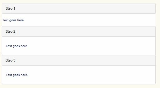
If everything went correctly your article should look like the Screenr video above.