Title in the middle within a Given Category + Image under it | Community
Skip to main content

Title in the middle within a Given Category + Image under it

  • March 18, 2021
  • 29 replies
  • 0 views

Hi guys,

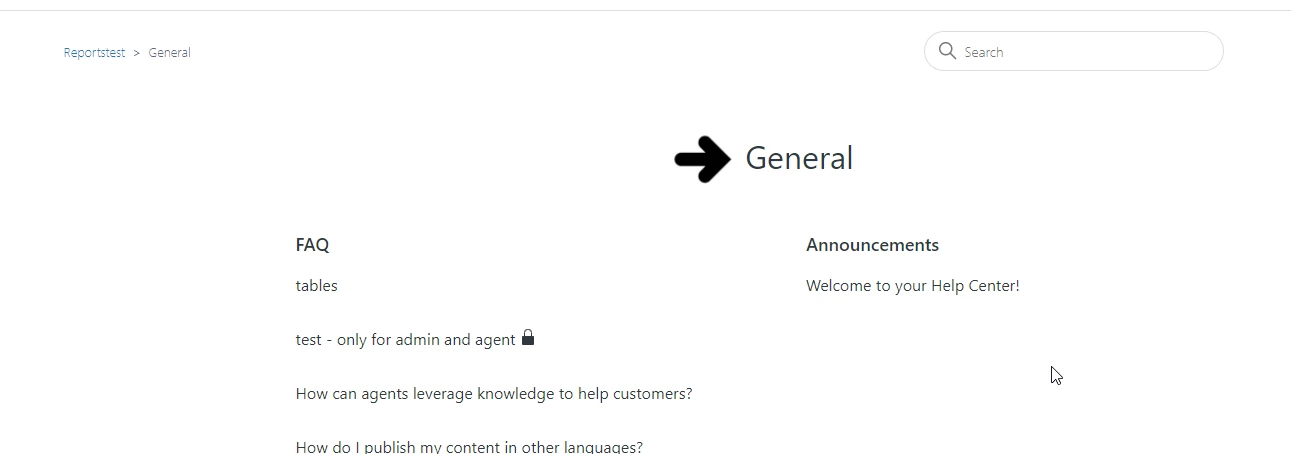
I am using an already customized theme, but this is how my help-center looks:


I think it looks great, simple so perfect for me. 

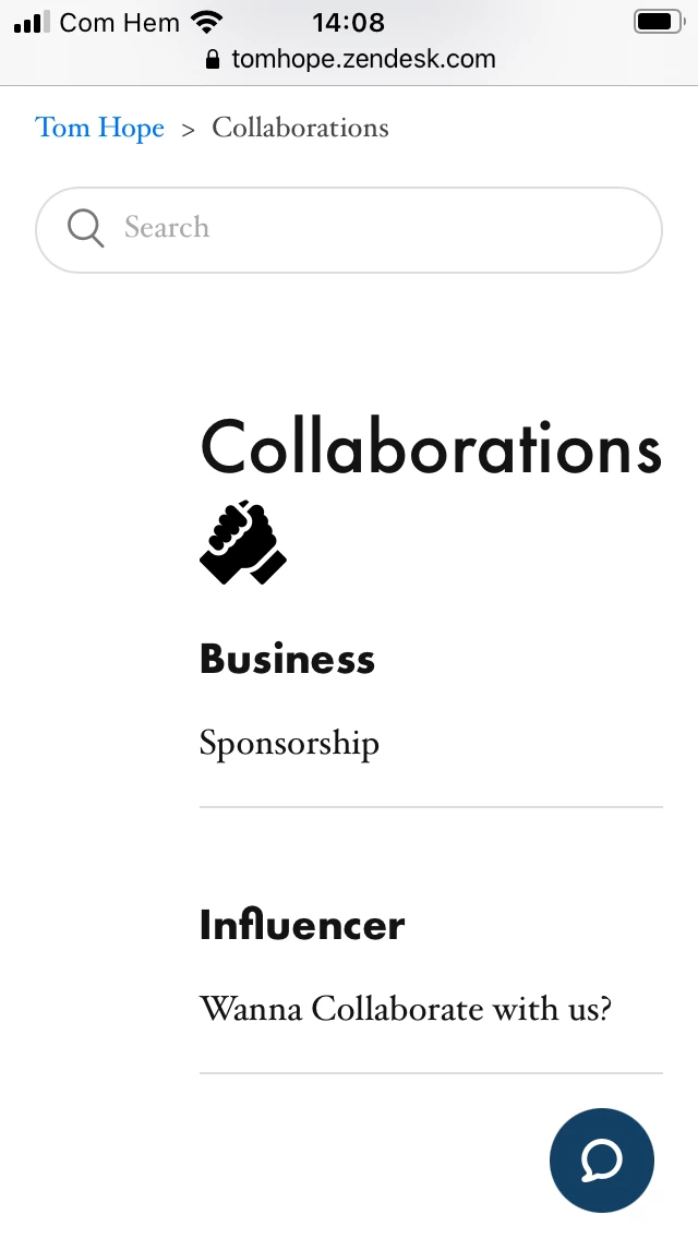
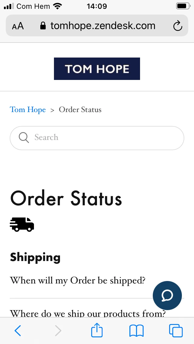
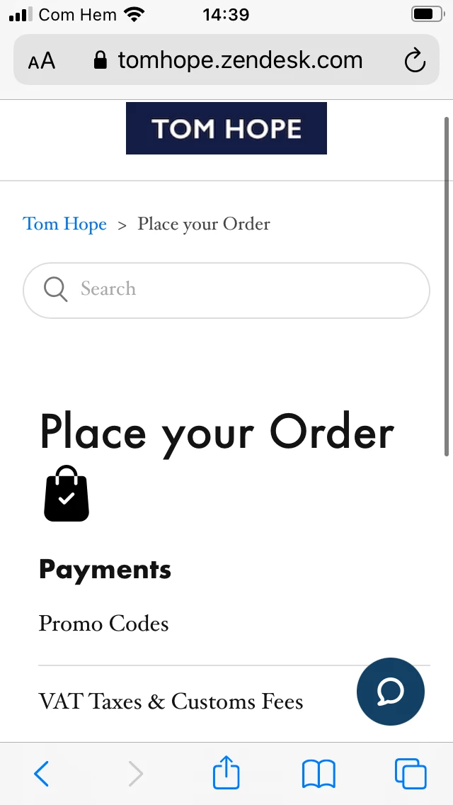
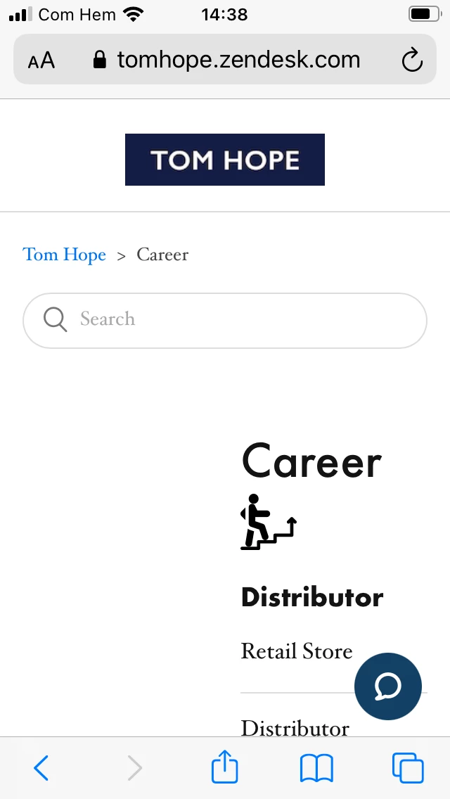
As you can see here there are like 9 Categories.

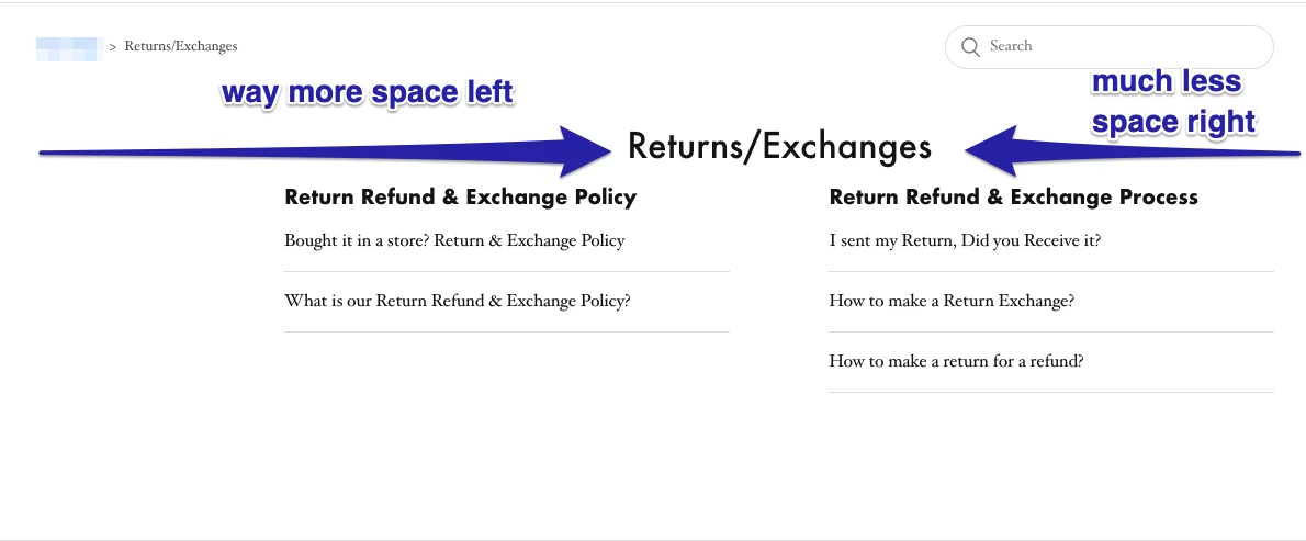
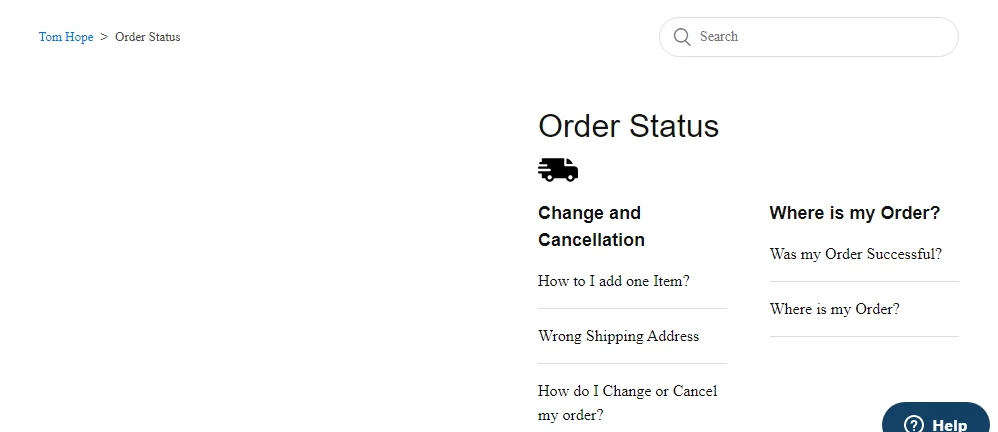
When I click on one category, let's say Return&Exchanges, this is how it looks:

The Category title is on the left (not centered) 


I would like to ask you guys/developers out there, how can I make it so that ALL my Category Titles are Centered and NOT on the left side? Do I have to do it one by one for each h1? or is there a way to affect all h1 at once and put all Category Title in the middle (not sections, category titles). 

Also then is there a way to add an image right under Category h1 and also put it in the center? 

I hope I was clear. If not let me know and I'll follow up!


Thanks in advance, looking forward to solving my small issue here! 


This topic has been closed for replies.

29 replies

  • March 18, 2021

HI, 362346112867 I'm no expert but could help.

You could resolve it in a few ways. The most simple way it's to add a setting for the <h1> tag in the category template. in the example below, I set settings in the category_page.hbs - default template for the category.

Code below: In the Copenhagen theme, it's row 17.

 <h1 style="text-align: center;"><img src="https://image.freepik.com/free-icon/thick-right-arrow_318-8433.jpg" width="80" height="80" align="middle" style="
margin-bottom: 25px; margin-top: 0px;">{{category.name}}</h1>

The result should be like these: 

The title will be in the center with the image for all categories where you will use this template.

If you want that the image will be under category title you could use this code:

        <h1 style="text-align: center;">{{category.name}}
<div>
<img src="https://image.freepik.com/free-icon/thick-right-arrow_318-8433.jpg" width="80" height="80" align="center">
</div>
</h1>


If you want to use pictures from the asset: just add a picture and replace in the code src="https://image.freepik.com/free-icon/thick-right-arrow_318-8433.jpg" on src="{{asset value}}"


  • Author
  • March 18, 2021

Thanks a lot for the quick tips.

I managed to make the title in the middle, however, somehow it creates an unbalanced middle probably due to the left bar see screenshot:

Also, I really appreciate your effort for the image, but what I meant was to insert an image UNDER the title and make this image different for each title and also in the middle (but the real middle ) so to speak LOL ;)

Thanks again mate! 


  • March 18, 2021

@Edwin Ha got it LOL :)

You could fix/set position via padding-left and padding-right. The value should be in px or the %.

        <h1 style="text-align: center; padding-left: 0px;padding-right: 150px;">{{category.name}}
<div>
<img src="https://image.freepik.com/free-icon/thick-right-arrow_318-8433.jpg" width="80" height="80" align="center">
</div>
</h1>

About images - I got it. Try to share with you the code later. 


  • Author
  • March 18, 2021

Hi Danila,


You're a life savior really! That was SO VERY helpful ;)

It's exactly like I wanted, the only thing though is the picture is being applied for all the categories,

What would be the best practice to get an individual picture for each category, would that work also on the category_page_hbs?

Should I name each category maybe?


  • March 18, 2021

It's possible to apply individual pictures for each category. Need to set condition with zendesk helpers in the category_page_hbs, and it will work. I am working right now on our theme, so later, I will try to do it for you - in my free time. if you don't want to wait you could try to do it by yourself. 

This article could help: https://support.zendesk.com/hc/en-us/articles/216367358-Help-center-templating-cookbook 


Brett13
  • Community Manager
  • March 18, 2021

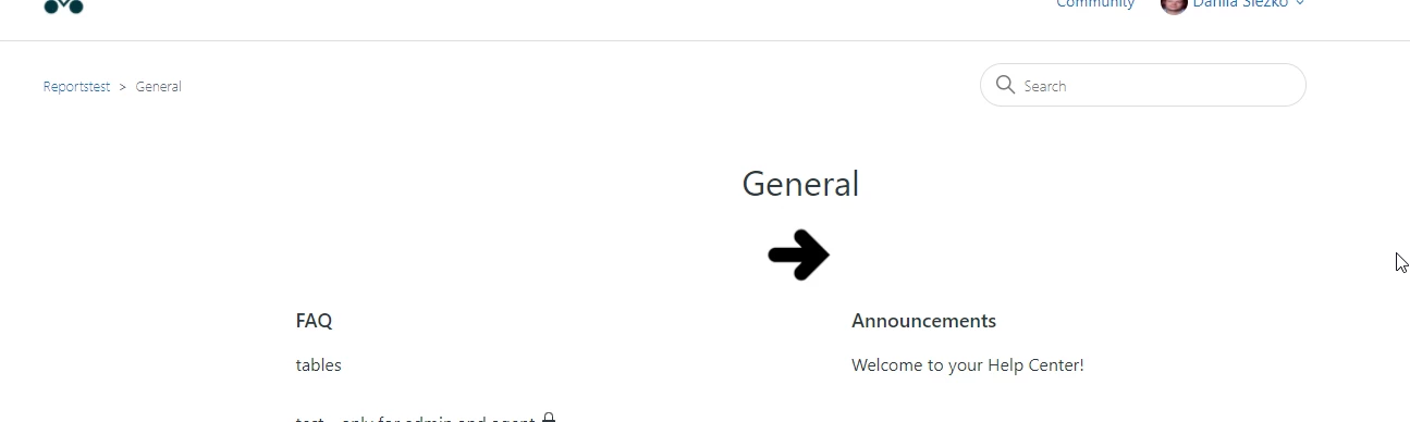
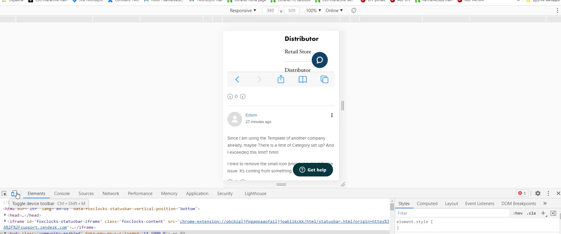
Thanks so much for jumping in to help here Danila :)


  • Author
  • March 18, 2021

I'll check it but I still wait ;)

Thanks again Danila! 


  • Author
  • March 19, 2021

Hey @Danila Slezko,

I had to keep you posted lol, I'm so proud I managed to figure it all out on my own, I mean almost ;)

Here is how the help-center looks so far: https://tomhope.zendesk.com/hc/en-us

Partly thanks to you mate! I managed to implement small icons right in the middle-ish of each category.

Love the pleasure it bring, coding is pretty cool actually! Thanks again dude, Zendesk should hire you, you ROCK! 


  • Author
  • March 19, 2021

Oh, it's strange, I just tested the URLs on a private window and the small icons don't show. Super weird... 

On my regular browser it shows, how is it for you? Anything I should do? Or is it maybe the free icon website I used that has some kind of security for that?


  • Author
  • March 19, 2021

Here is an example of the code I wrote:

{{#is category.id 360003075919}}
<img src="https://www.flaticon.com/svg/vstatic/svg/655/655640.svg?token=exp=1616146439~hmac=6be6a268057e683ade82c6d62268e7ed" width="40" height="40" align="center">
{{/is}}
{{#is category.id 360003075819}}
<img src="https://www.flaticon.com/svg/vstatic/svg/1670/1670915.svg?token=exp=1616144834~hmac=32e6d17a4197ee95483cad94d78bf324" width="50" height="50" align="center">
{{/is}}


If I test each URL: https://www.flaticon.com/svg/vstatic/svg/655/655640.svg?token=exp=1616146439~hmac=6be6a268057e683ade82c6d62268e7ed 

I can see that there is some kind of error on Private browsing, it must come from that, these are only token.


Do you know how I can sort it out? Should I download each icon and fix it in another way assets maybe? 


  • March 19, 2021

Hi, try to download the necessary icons and add them to the assets and add to code (below). it could help - some workaround solution :)

{{#is category.id 360003075919}}
<img src="{{asset 'youricon1.svg'}}" width="40" height="40" align="center">
{{/is}}

{{#is category.id 360003075819}}
<img src="{{asset 'youricon2svg'}}" width="50" height="50" align="center">
{{/is}}

How to work with assets: https://support.zendesk.com/hc/en-us/articles/115012399428?page=1 


  • Author
  • March 19, 2021

OK sorry for the SPAM,

I MADE IT WORK HAHA! ! WITH ASSETS ;)


https://tomhope.zendesk.com/hc/en-us/categories/360003075959-Manage-your-Account

Yeehaww! 


  • March 19, 2021

If you don't use your corporate web icons and want to use some free design solution - it's better to download it and add it to the asset. Link on the free solution can change any time, or icons from the source site can be deleted. So for free design solution things, it's better to download what you want and store it on your computer or some web cloude. 


  • March 19, 2021

My Congratulation !!!!


  • March 19, 2021

Now you could practice and try to add the same icons for categorys on the home page LOL ;)  - haha sorry for spam)


  • March 19, 2021

By the way. Visit this site https://www.zendesktheme.com/ - you could find where some free themes. It could help you save a lot of time.  


  • Author
  • March 19, 2021

That could be interesting but that would be only "extra fun" maybe ;) 

In the meantime, I encountered another issue actually.

I need everything to be responsive. And you remember the code you helped me with to get the right "Padding so it would be in the middle" 

Well it worked when I was on my laptop browser it was perfectly in the middle:

<h1 style="text-align: center; padding-left: 0px;padding-right: 225px;">{{category.name}}

But on Mobile, it was looking awful and not responsible on my iPhone

So what I did is that I Removed the padding and changed the text-align: left instead of the center so:

<h1 style="text-align: left;">{{category.name}}

Now it is way more responsive but I do believe it doesn't look that cool on browser laptop no more:

https://tomhope.zendesk.com/hc/en-us/categories/360003060620-Product-Information


Or what do you think? 

Do you have best practice to have all categories responsive on mobile and then change the look on laptop but it would only affect the laptop mode?

Haha It's a headache but I like it so far ;)


Thanks a LOT DUDE! 


  • Author
  • March 19, 2021

Also I don't know why but when I have tested on my Phone all my categories and even though I didn't make any distinctions in the code, some categories like:

Carreer

Collaboration

Store Locator

Don't appear like they should (which is all the way to the left like all the others)

I've checked the code and it's all the same settings:

<h1 style="text-align: left;">{{category.name}}
<div>

{{#is category.id 360003075919}}
<img src="{{asset 'exchange-icon.svg'}}" width="40" height="40" align="left">
{{/is}}
{{#is category.id 360003075819}}
<img src="{{asset 'Order-Status-Icon.svg'}}" width="50" height="50" align="left">
{{/is}}
{{#is category.id 360003060620}}
<img src="{{asset 'Product-Information-Icon.svg'}}" width="40" height="40" align="left">
{{/is}}
{{#is category.id 360003060660}}
<img src="{{asset 'Place-Order-Icon.svg'}}" width="50" height="50" align="left">
{{/is}}
{{#is category.id 360003075939}}
<img src="{{asset 'Collaboration-Icon.svg'}}" width="50" height="50" align="left">
{{/is}}
{{#is category.id 360003062440}}
<img src="{{asset 'Complaint-Icon.svg'}}" width="50" height="50" align="left">
{{/is}}
{{#is category.id 360003060680}}
<img src="{{asset 'Store-Locator-Icon.svg'}}" width="40" height="40" align="left">
{{/is}}
{{#is category.id 360003079819}}
<img src="{{asset 'Career-Icon.svg'}}" width="50" height="50" align="left">
{{/is}}
{{#is category.id 360003075959}}
<img src="{{asset 'Account-Manage-Icon.svg'}}" width="50" height="50" align="left">
{{/is}}
</div>
</h1>

{{#if category.description}}
<p class="page-header-description">{{category.description}}</p>
{{/if}}


Do you know what it could be?


  • Author
  • March 19, 2021

Here are two pictures that illustrate the issue on responsiveness on mobile


I would love to fix this so it looks all good like the Order Status page on all category pages 


And then I would love to make it look like it was before on desktop (in the middle instead of Left) but ONLY for the Desktop version 


DAMN IT AINT EASY!! HAHA


  • Author
  • March 19, 2021

Look at all that space on the left side of that Career Category DAMN!

Doesn't make any sense really... 


  • Author
  • March 19, 2021

Since I am using the Template of another company already, maybe There is a limit of Category set up? And I exceeded this limit? hmm 

I tried to remove the small icon (img) but it didn't fix the issue. It's coming from something else


  • March 19, 2021

Ohh. I don't think that I could help you with cross-platfom/сross -browser layout via screenshots and communication in this article.

You need to check and set mobile devices' conditions via CSS classes - in the style.css file in the zendesk (could be also *.css files in the zendesk assets).

It's better to find some person who worked with this already.

If you want to try to do it yourself, you could start working in the code editor in the browser (click F12 button on your keyboards) > Toggle device toolbar - you could check how your pages will look like on the mobile devices after your changes in the code (HTML,css,.)


  • Author
  • March 19, 2021

It's making me mad lol DOESNT MAKE SENSE!!! 

Why would only these 2-3 category won't display properly and why all the others work fine and are RESPONSIVE....  Do I need to touch somthing on the style.css? Feel I was so close to fixing all yet SO FAR! 


Ifra
  • March 19, 2021

Hey Edwin, copy this given code and paste on your stylesheet then test on desktop and mobile device and let me know if your bug resolve:

.category-content{
width:100%
}


After adding this your alignment issue will also fixed on desktop resolution.


And that bug isn't only in 2-3 categories that exist in all. You need to set the width:100% because when the section will have articles with small title then your page will look like this on tablet and mobile device:


Thanks


  • Author
  • March 22, 2021

@Ifra Saqlain You're a life savior too, just like @Danila Slezko

It just worked immediately wow!

Do you have a best practice to show the title of each categories in the middle so it's also responsive? Is that best done in category section file or in css file?

Thanks so much! I may try to customize the buttons now hehe @Danila Slezko