Mobile view - Help Centre | Community
Skip to main content

Mobile view - Help Centre

  • May 25, 2022
  • 6 replies
  • 0 views

Ema

Hello,

We are looking at revamping our Help Centre and trying to identify the best way to adapt it on mobile - as our main user base is using mobile devices rather than the desktop version.

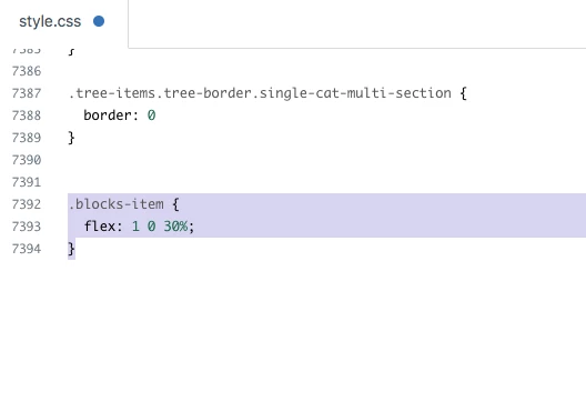
What I am trying to achieve mainly is a wrap of the categories on the mobile version (same way they are being displayed on desktop). 

I did not find any relevant article and I am not sure where I should go in the code to make that happen. 

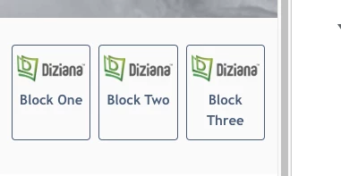
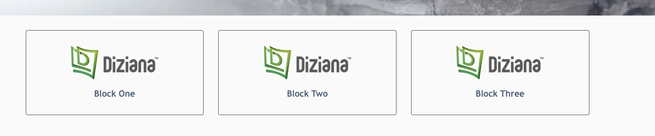
For visuals this is the Desktop theme and I want it to show the same way (obviously smaller size) when I open it on mobile - instead of having to scroll to see each category.

6 replies

Ifra
  • May 26, 2022

Hey Ema Rotariu,

You can achieve it by CSS, but yes something would be changed in your UI for small devices.


Example:- Block on a small device.


Blocks on Desktop:-


I only change the CSS code:-

Hope it would be helpful :)


Thanks 

Team


Dispatch/Procurement

Hello!

I have almost the same inquiry as Ema's. 

When I upload the Hero image of the Help center in 1600x300 px size, it appears perfect on desktop view but becomes enlarged on mobile view and cuts out on Apple PC view. We also believe our customers use mobile devices rather than the desktop to open our website and order products. After research, I've come to know that to make the image adjustable and adaptable according to the screen size, we need to add a block of CSS in the main code. 

Can anyone please suggest to me what (block of code) to be added exactly to make the hero image of the help center/community banner/community page hero image adaptable according to the screen size whether mobile or desktop?
@ifra


Ifra
  • October 28, 2023

@Laveeza Yasin, you can see the code in Copenhagen theme where the code is responsive.

Try this and let me know if any issue :)

Hero image wrapper HTML:

<section id="main-content" class="section hero">

</section>


CSS:

.hero {
    background-image: url(//theme.zdassets.com/theme_assets/9673686/eabf508….jpg);
    background-position: center;
    background-size: cover;
    height: 300px;
    padding: 0 20px;
    text-align: center;
    width: 100%;
}

Dispatch/Procurement

Thank you @ifra for your response :)


  • June 11, 2024

Im having the same issue, however right now my code is exactly the same as 
 @ifra  provided, but it is still not showing the whole image.  its only showing the ⅓ of it. 


Ifra
  • June 13, 2024

Hi,  setting panel has only a setting to choose the image, 

the image can be updated on specific breakpoints we can use media-query in CSS and change the image.

upload the image in the asset folder and use that in CSS with a media query for devices with different resolutions.


Also, you can see the solution here: 

https://stackoverflow.com/questions/12609110/responsive-css-background-images