
I am working with inserting videos in a table to make a tutorial page. It looks great, however, when I test it on a mobile device, the second column is cut off and you can't get to the video.
I have two rows and two columns. Attached is what the screen looks like.
How can I make the table responsive. We are using a theme from Lotus. 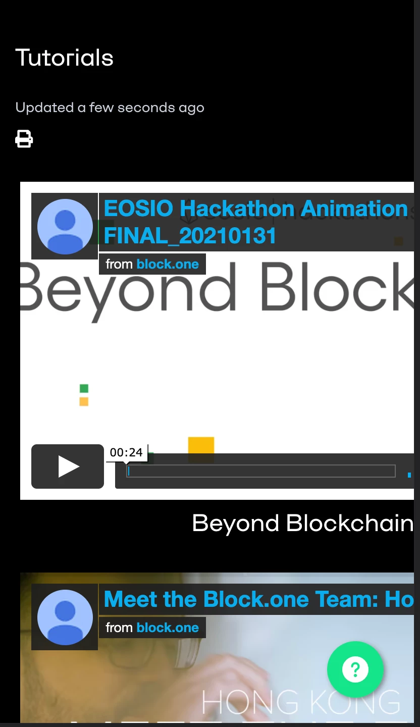
Thanks for reaching out!
Without seeing how the CSS is currently applied, I can’t say for certain the best way to tackle this. That being said, the first step I would take is determining what styling is currently being applied to the table elements and video. Then, I would take a look at the media queries being used to apply styling to the elements at different screen sizes. From there, you should be able to change up the styling and potentially add relative units for a more responsive experience.
Lastly, I’d also check if there are any style attributes on the video/iframe in the HTML. A quick Google search should return a few techniques you can use to get these to display in a responsive manner.
I hope this helps! Feel free to reach out with any questions.
Tipene