Links in Gather posts are not easy to see | Community
Skip to main content

Links in Gather posts are not easy to see

  • August 6, 2020
  • 10 replies
  • 0 views

When I post a link in a Community post, users cannot (usually) see the links provided.  I cannot change the font color or underline my link to make it more clear.  My links are black font and look like the other text around them.  Note: When my coworker adds links to a post in Gather, sometimes hers show up blue and sometimes they don't (see image below for an example).  It's very inconsistent.

For the image below, both of these items are links and were added by the same person.  We made them italic so that they would be obvious to our users.  For the second one, the only way for the user to know it's a link is if they hover over it or if we say in our language "here are links to...".  We've had users complain lately that they don't have links to resources, when actually they were indeed in the article they just couldn't see them and didn't know to hover over them. 

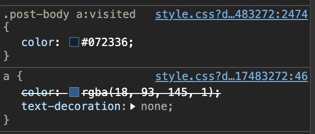
When we go to add links, they should consistently appear blue and be obvious to users that they are links.  

Context: We are Gather Legacy


10 replies

Ryan48
  • August 7, 2020

Hey @susan11

This sounds like something that needs to be updated in your theme. In the Copenhagen Theme, links are set to be blue. If you can share a link to a post where this might be happening, I might be able to help you track down what's going on and point you toward how to update it.

Thanks!


Ryan48
  • August 7, 2020

Additionally, you might find this CSS Cookbook information helpful.


Ad17
  • August 7, 2020

Thanks @ryan48! I work with Susan and checked our css file. There are currently no question or answer elements, is this because we are on Gather legacy? Forgive my mediocre HTML skills. We currently have the link color set to our brand color of blue, as well as the article links in the css (.article-body a). What am I missing? 

Thank you for your help and your patience, we really appreciate it!


Ryan48
  • August 11, 2020

Hey @ad17,

Can you send me a link to a post where this is happening? That'll help me take a look into this.

Thanks!


Ad17
  • August 11, 2020

Here is the post. All of the bullet points are links (except under Product Feedback). We have asked several users to look at the same page, and the link color is not consistent. Here is a screenshot of my view - all of the links under the section "Ways to engage in the Community" further down the page are blue as expected, 


Ad17
  • August 11, 2020

Here is a screenshot of a different user's view:


Ryan48
  • August 12, 2020

EDIT - I should have read your response more carefully, I missed that you linked to the post! I'm going to go ahead and raise a ticket so we can take the conversation over there. I'll post the resolution back here once we've troubleshot your issue.

Thanks!


  • August 12, 2020

As far as I can tell, this is because of your CSS style for this expression:

.post-body a:visited

When I look in my browser's developer tools, I can see that the color of visited post-body links is a of different color than regular links:


Ad17
  • August 18, 2020

Thank you @ryan48 for helping with the ticket! By following your instructions, we have the links now in blue regardless if they have been visited. 


This color is set on line 2474 of your styles.css in your theme and looks like this. It only applies to links in your community.

.post-body a:visited {
  color: #072336;
}

If you want them to always appear as the normal blue and not have this "visited" behavior, just delete the whole rule (lines 2474 to 2476) and publish those changes.


  • Author
  • August 18, 2020

@ryan48 and @kasper11 - Thanks for helping us!