Change the size of the search bar (Copenhagen Theme) [CSS] | Community
Skip to main content

Change the size of the search bar (Copenhagen Theme) [CSS]

  • October 25, 2019
  • 4 replies
  • 0 views

Hello,

I've tried to change the size of the search bar (I have dynamic content in the placeholder, so the size needs to adjust depending on language).

I've tried to change it and I get a great result on my PC, but on the phone it looks awful, checked my co-workers screen and it looked awful as well.

So where do I change the size at the same time as I keep it responsive?


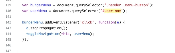
(Also, on mobile devices, the "menu button" in the top right corner does not work, any tips?)

4 replies

Ifra
  • October 26, 2019

Hi Andreas,

You should try this , as you said ,I did it by using Copenhagen Theme.

Copy this code and paste on your stylesheet  at the bottom.

.hero-inner .search.search-full{
width:70%;
margin: 0 auto;
}
@media (min-width:768px){
.hero-inner .search.search-full{
width:100%;
}
}


On your PC , width set default but on your small devices search bar width will be 70% and you can change it and also change media query like .: @media(min-width:1024px) , @media(min-width:480px)  ,@media(min-width:320px)  , as per your requirement .


And "menu button" is working in Copehagen Theme , may be something wrong with your header CSS code that's why it happened.

Once you make sure this JS code exist in your script.js file.


Thank You
Team Diziana


  • Author
  • October 28, 2019

Hey,

I tried to paste it in, but I still see it like this:


When I make the window smaller then 768px it shows it like this:

Which is awesome!
Do you have any ideas?


Devan
  • October 28, 2019

Hello 367066863047,

Would you happen to have any thoughts regarding 366768283328 question?

Thanks!


Ifra
  • October 29, 2019

Hey Andreas,


For mobile screen you need to  reduce font size of your placeholder text , search icon , left and right padding of searchbar. If your searchbar placeholder text is too long then that will be hide according your searchbar width.

Remove  code which I answered above.

Once try this code snippet . Copy and paste at  bottom of stylesheet.

/* Hero section searchbar */
 
.hero-inner{
max-width:610px;
margin: 0 auto;
}

.hero-inner .search input[type="search"]{
width:100%;
padding-left: 40px;
padding-right: 20px;
}

.hero{
padding: 0px 10px;
}

@media (min-width:767px){
.hero{
padding: 0px 20px;
}
}

@media (max-width:600px){

.hero-inner .search input[type="search"]{
padding-left: 30px;
padding-right: 10px;
font-size: 12px;
}

[dir="rtl"] .hero-inner .search input[type="search"]{
padding-left: 10px;
padding-right: 30px;
}

.hero-inner .search::before{
left: 12px;
right:auto;
font-size: 13px;
}

[dir="rtl"] .hero-inner .search::before{
left: auto;
font-size: 13px;
right: 10px;
}
}


/* For searchbar icon color */

.sub-nav .search::before{
color:#fff;
}

/* Code for smaller then 768px screen */

@media (min-width:600px){
.sub-nav{
flex-direction: row;
}
.sub-nav input[type="search"] {
min-width: 300px;
}
}


Smaller then 768px screen resolution:


320px screen resolution:


Please let me know if any issue.


Thank You 

Team Diziana