I have a table on an article that renders perfectly on desktop view but on mobile view it stacks.
Article link here under "Coding and Database"
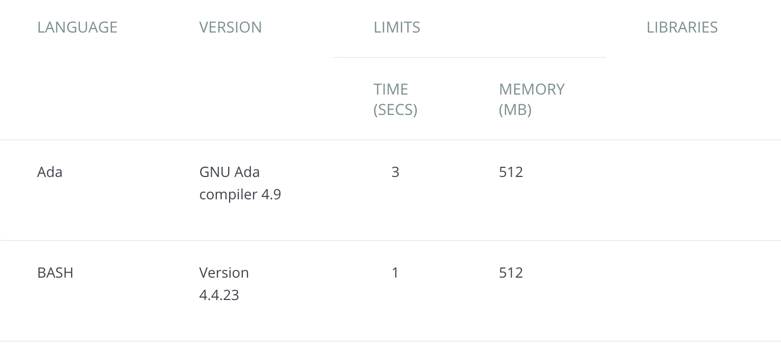
Desktop View:
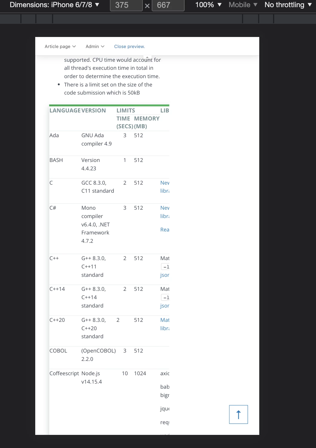
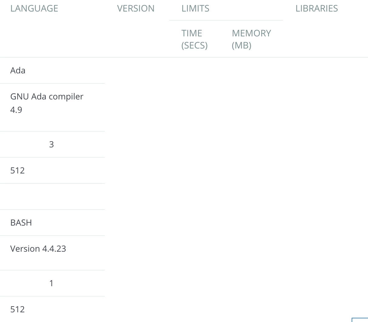
Mobile View:
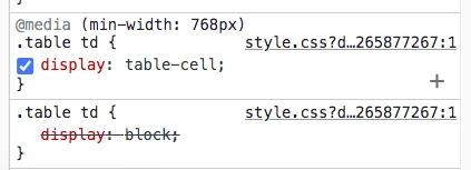
I have this in my style.css file:
@media(max-width:1024px) {
.table {
  overflow: scroll;
  display: block;
  width:100% !important;
}

.table td, .table th {
  padding: 10px 20px;
}

.table td {
  width: auto !important;
  height: auto !important;
}

.table tr {
  display:table-row;
  height: auto !important;
 }
}