Article Table Mobile Overlapping | Community
Skip to main content

Article Table Mobile Overlapping

  • September 20, 2021
  • 4 replies
  • 0 views

Steven22

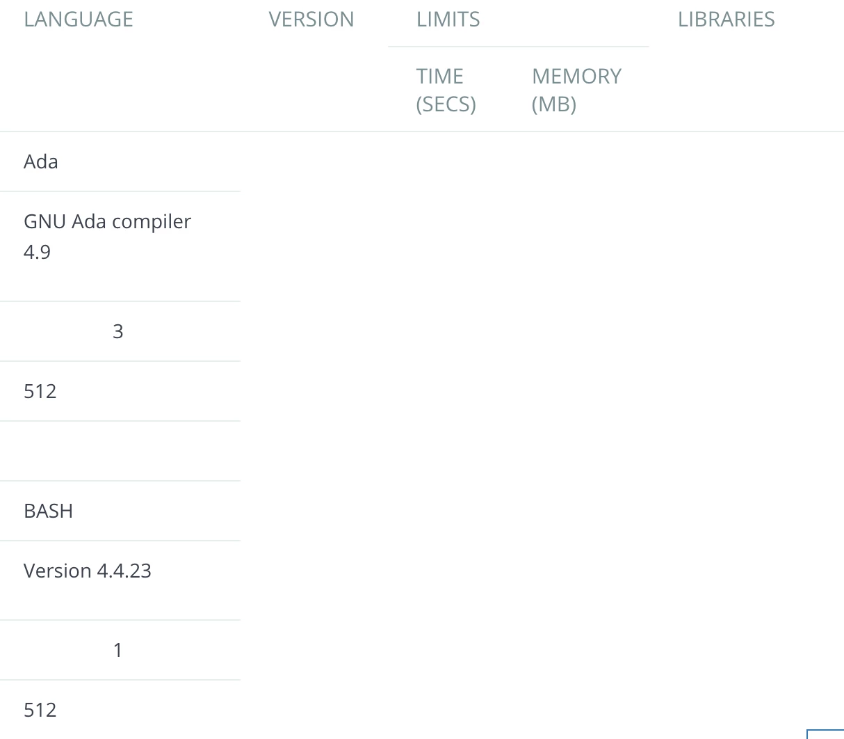
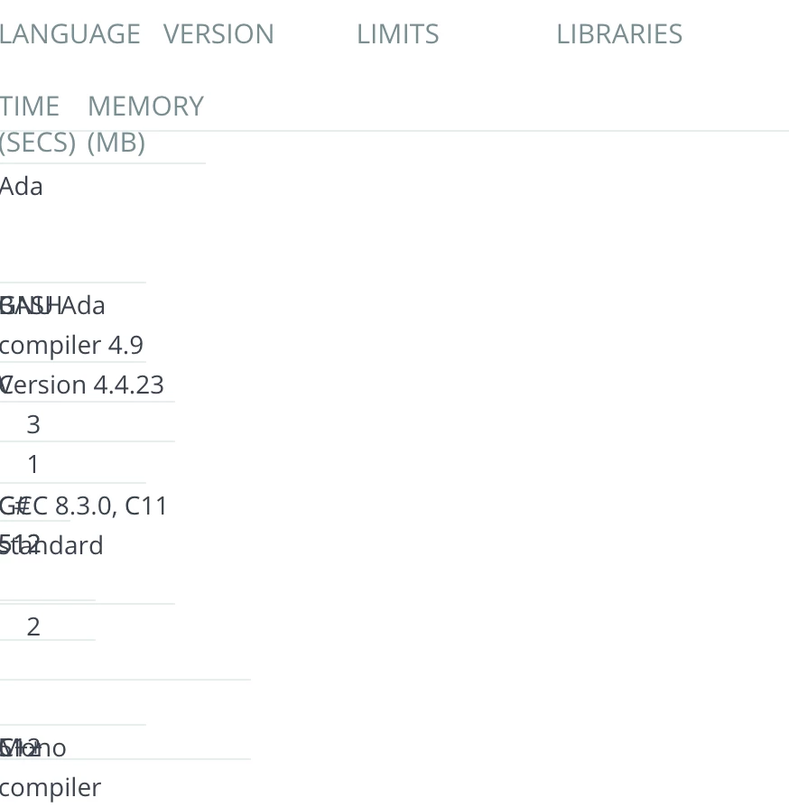
I have a table on an article that renders perfectly on desktop view but on mobile view it overlaps. 


4 replies

Pulkit12
  • September 21, 2021

Hi Steven Dai

Is it possible to share the live URL of your article where it's happening, so that I will go through it and provide you a relevant solution.

Thanks

Pulkit


Steven22
  • Author
  • September 21, 2021

Hi Pulkit,

Here's the link


Pulkit12
  • September 22, 2021

Hi Steven Dai

Place the below CSS at the bottom of your style.css file 

@media(max-width:1024px) {
.table {
overflow: scroll;
display: block;
width:100% !important;
}

.table td, .table th {
padding: 10px 20px;
}

.table td {
width: auto !important;
height: auto !important;
}

.table tr {
display:table-row;
height: auto !important;
}
}

Let me know if it solves your issue 


Thank You 

Pulkit

Team Diziana


Steven22
  • Author
  • September 22, 2021

Hi Pulkit,

Thanks for the reply! To be clear, I add that to the bottom of the style.css in the customize design/theme right? If so, it looks like it sort of fixed it in that it doesn't overlap anymore however it's still not completely rendering properly: