Article Section Page - Split Articles Column into 2? | Community
Skip to main content

Article Section Page - Split Articles Column into 2?

  • January 21, 2021
  • 27 replies
  • 0 views

Hi guys!

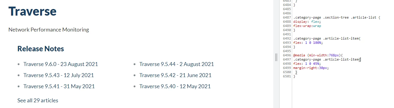
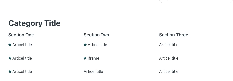
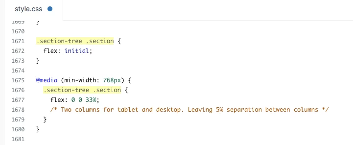
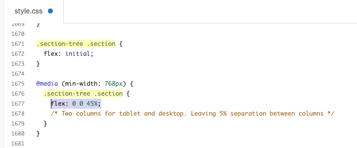
I was wondering if anyone can help me figure out how to put the articles list in the sections page 2 columns? Pretty much like this: https://support.zendesk.com/hc/en-us/sections/206667367-Setting-up-Zendesk-Guide

Thanks :)

27 replies

Ifra
  • January 22, 2021

Hey, you can use this code just need to copy and paste it, I tried it on Copenhagen Theme so you need to pay attention to the class name if your template has any different classes.

.section-content .article-list{
display: flex;
flex-wrap: wrap;
}
@media (min-width:768px){
.section-content .article-list-item{
width: 50%;
padding: 0 20px 0 0;
}
[dir="rtl"] .section-content .article-list-item{
padding: 0 0 0 20px;
}
}


Team


  • Author
  • January 22, 2021

Hi! Omg, thank you so much, that's helped! You're amazing!

I'm so sorry, do you think you can help with 1 more thing? It's split it into the 2 columns, but I want them possibly stacked the other way:

e.g. it used to be:

A
B
C
D

And now it's:

C | A
D | B

I'm hoping to get it to be:

A | C
B | D

Thanks :)

EDIT: I think I got it going by adding "flex-direction: row-reverse;" here:

.section-content .article-list{
display: flex;
flex-wrap: wrap;
flex-direction: row-reverse;

Thank you so much again though!!


Ifra
  • January 22, 2021

Okay, you want to reverse the columns.

Remove previous code and copy-paste this code:

.section-content .article-list{
display: flex;
flex-wrap: wrap;
flex-direction: row-reverse; //only added this property
}
@media (min-width:768px){
.section-content .article-list-item{
width: 50%;
padding: 0 20px 0 0;
}
[dir="rtl"] .section-content .article-list-item{
padding: 0 0 0 20px;
}
}

Ifra
  • January 22, 2021

Awesome! 


  • September 17, 2021

Does this go in the style.css? 


Ifra
  • September 21, 2021

Hi @Cesar Perez, 

Yes, it goes to the style.css file at the bottom.


Thanks :)


  • September 21, 2021

Thanks - So I did add it, but the articles are still showing up as one column, and not two. Anything else we can try or do? 


Ifra
  • September 21, 2021

Okay, you can share your HELP CENTRE public URL here, I'll figure out what's the issue?

May be it's because different class-name.


  • September 21, 2021

Sure, it's helpdesk.kaseya.com, and account assumption is enabled if you need it. Thanks.


Ifra
  • September 21, 2021

Add the below CSS code into style.css file and check the section page list:

.section-page .article-list {
display: flex;
flex-wrap:wrap
}

.section-page .article-list-item{
flex: 1 0 100%;
}

@media (min-width:768px){
.section-page .article-list-item{
flex: 1 0 45%;
margin-right:30px;
}
}


and let me know if it solve your issue.


Thanks


  • September 21, 2021

I replaced the code with the latest one, and still no two columns for the KB articles. 


Ifra
  • September 21, 2021

KB Tree article, at homepage, right?


Ifra
  • September 21, 2021

Share the screenshot for which page you want to do this?


  • September 21, 2021

Ah, so here is what we would like to have two columns:

https://helpdesk.kaseya.com/hc/en-gb/categories/204079068

For each category page.


Ifra
  • September 21, 2021

Hi, replace the code , add this new snippet:

.category-page .section-tree .article-list{
display: flex;
flex-wrap:wrap
}

.category-page .article-list-item{
flex: 1 0 100%;
}

@media (min-width:768px){
.category-page .article-list-item{
flex: 1 0 45%;
margin-right:30px;
}
}

Output is:


  • September 21, 2021

Great! That worked.

Any way to have more than 3 bullets per column? 


Ifra
  • September 21, 2021

It's default functionality by Zendesk, when your sections have more than 6 articles it would be display a link 'See all XYZ articles'.


You can try this one solution for your requirement:

https://support.zendesk.com/hc/en-us/community/posts/4407376197274-Guide-Category-page-with-conditionally-expandable-section-lists


  • September 21, 2021

I will have a look later today.

Thanks for the help!


Ifra
  • September 21, 2021

Cool !


  • September 23, 2021

Is it possible for the sections to have two columns as well? 

https://helpdesk.kaseya.com/hc/en-gb/sections/4406076837265-Release-Notes


Ana34
  • September 24, 2021

Hi Cesar,

I will be opening a ticket for your questions, and we will continue the support via the ticket.

Regards, Ana

Ana S.
Technical Support Specialist at Zendesk | EMEA


Ifra
  • September 26, 2021

Hi Cesar, use this code for the section, only copy and paste it at the bottom area on stylesheet.


.section-page .article-list {
display: flex;
flex-wrap:wrap
}

.section-page .article-list-item{
flex: 1 0 100%;
}

@media (min-width:768px){
.section-page .article-list-item{
flex: 1 0 45%;
margin-right:30px;
}
}


Screenshot after adding the above code


John87
  • October 19, 2022

The default page for sections has two columns - one for each of the two categories I have.   I will be adding a 3rd category and would like them to show in rows - I searched around but couldn't find an answer.   Thanks in advance for any help


Dave12
  • October 20, 2022
Hi John, 
 
If I'm understanding you correctly, instead of having two columns of sections in your category page, you just want one, with each section listed below the last. If that's the case, then you can achieve this pretty easily by modifying one number in your theme's style.css file -- find this bit of code:
 
@media (min-width: 768px) {
  .section-tree .section {
  flex: 0 0 45%;
   /* Two columns for tablet and desktop. Leaving 5% separation between columns */
  }
}
 
and change that 45% to 100%.
 
 
and  

Ifra
  • October 20, 2022

@John DiGregorio, If I'm also understanding you correctly, you want three sections in a row like below:


To get this, go to your style.css file and find for classes and change the 45% to 33%: .section-tree .section


Currently (by default) you have 45% for two columns in a row:


After changing you will have 33% for three columns in a row:


If you want only single section in a row then it would be 100% for single column in a row:


Team