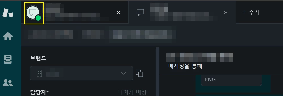
Dear Community,
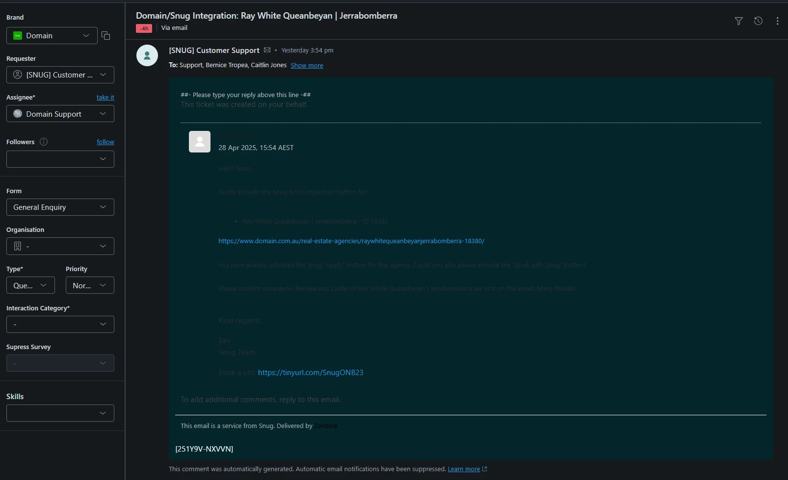
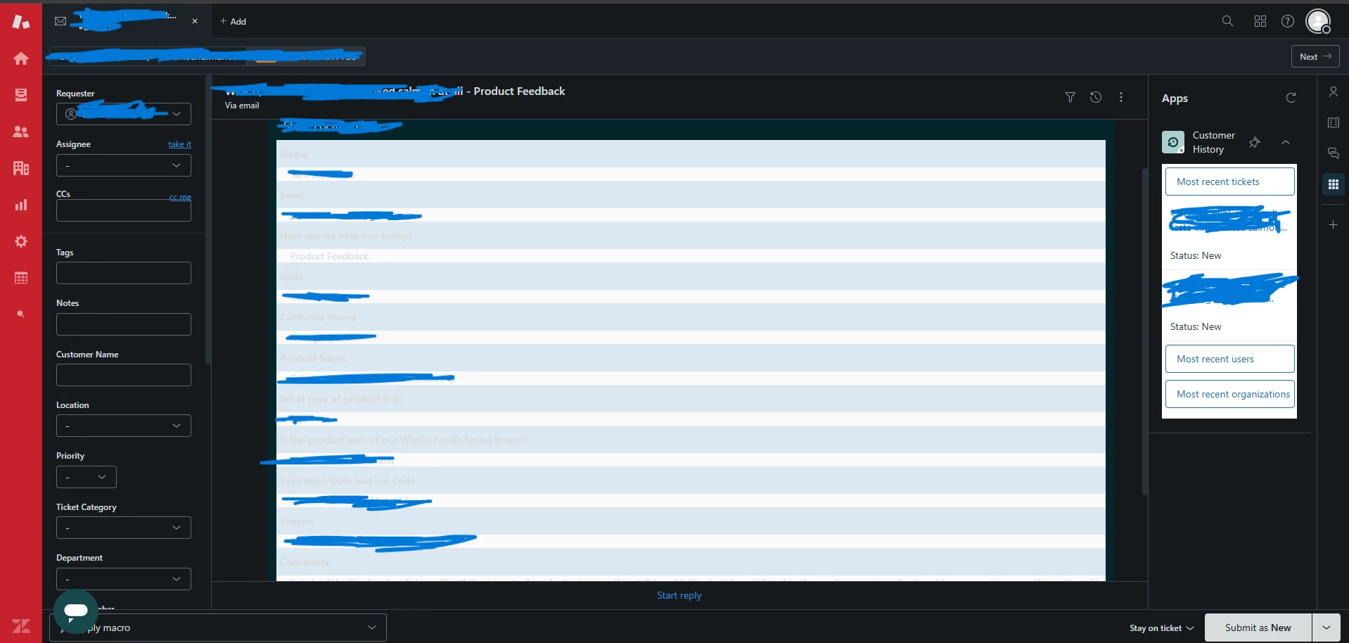
We are thrilled that Zendesk Dark Mode is now in your hands with our Zendesk Dark Mode EAP. We are thrilled to have you start trying this feature.
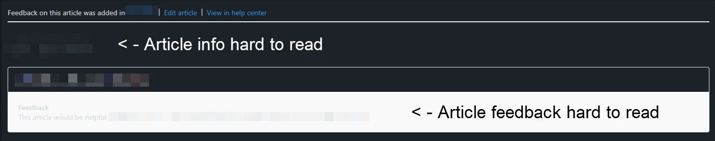
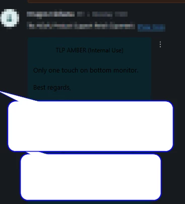
Please share your feedback with us here in the comments below to help us improve this feature! We appreciate you taking the time to share your insights.