
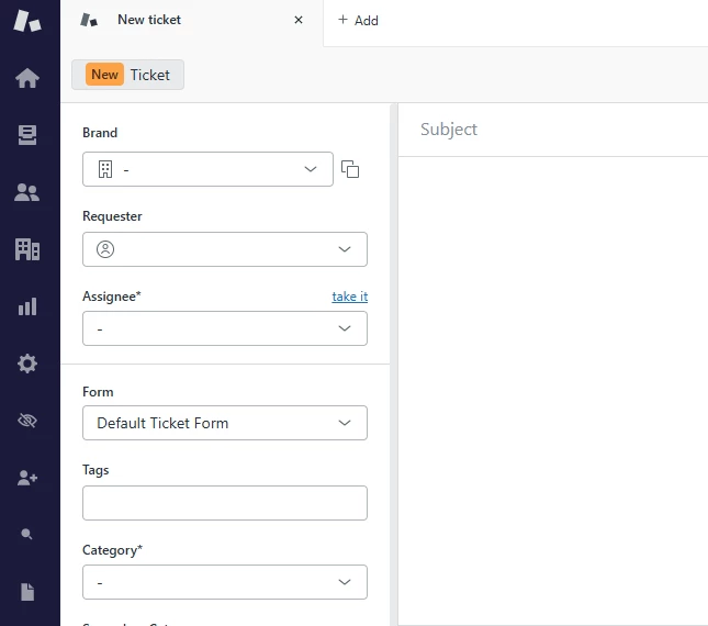
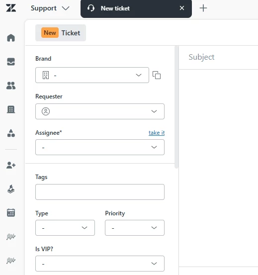
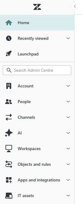
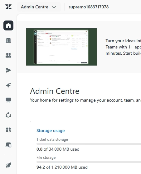
Please allow the option for custom Branding in the Unified Navigation feature. At its current state, it is very dull and everything is gray and blending, icons look like they are simply floating in space, there is no contrast or visually pleasing accents. I am sharing comparisons between my current setup and the Unified Navigation EAP in the Sandbox:
Support:
Admin Center (collapsed menus, no context on menus unless you hover) :
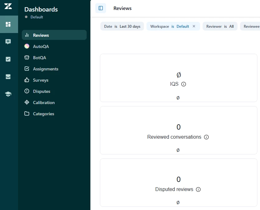
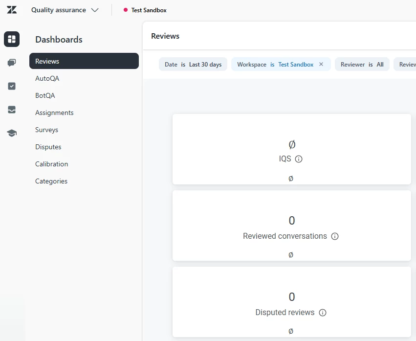
Quality Assurance (the worst look in my opinion):
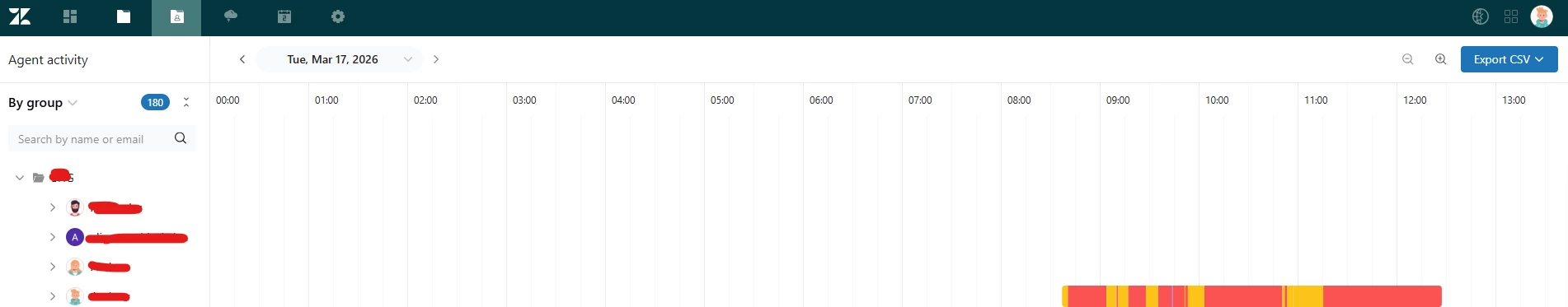
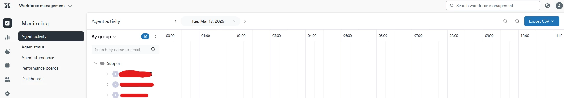
WFM (same collapsed menus as Admin Center):
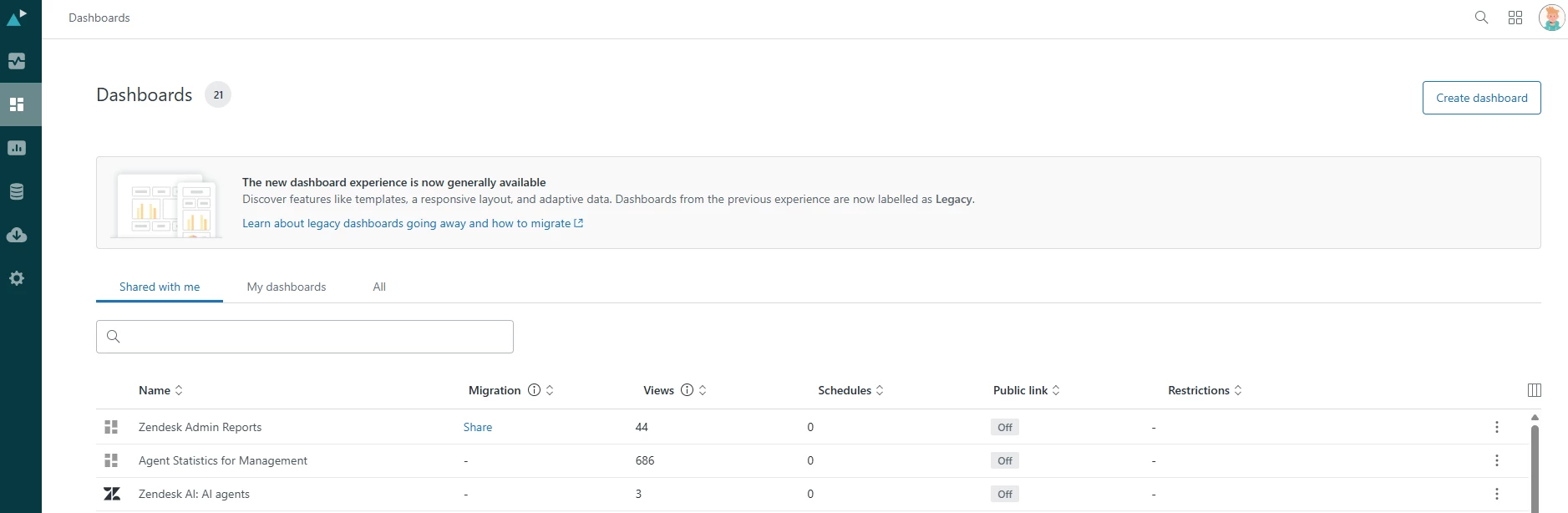
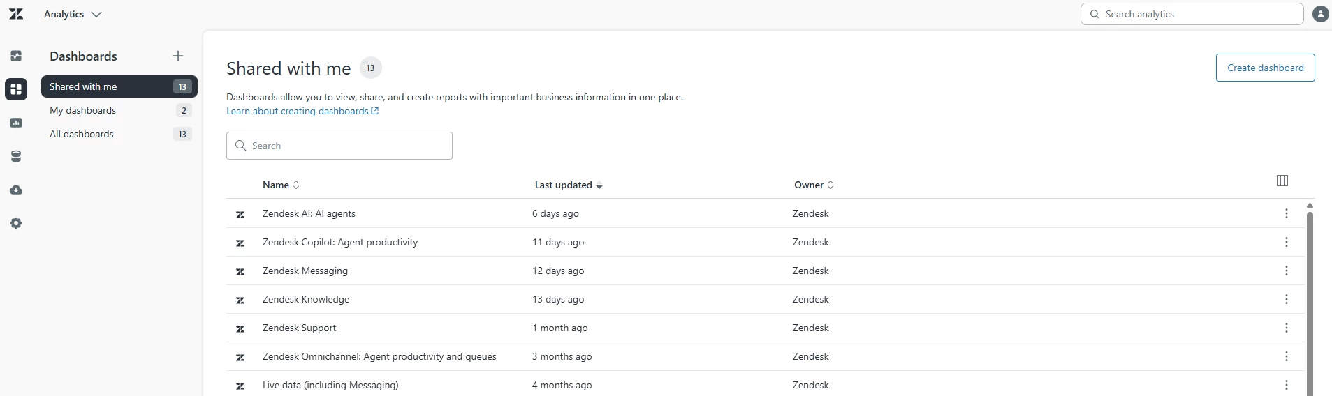
Analytics:
Separating the products in this post makes it easier to compare, but if you only have the Unified Navigation activated and navigate through the products, you can actually get lost and not know which product you are currently in for a few seconds. I understand the need and concept of unifying the system UI, but this feels a bit too much and there is nothing distinct between the products and removing the branding coloring and only using 2 shades of gray and white is an odd choice.
My main request is to please add some colour choices.
Thank you