Internal Notes vs. Public | Community
Skip to main content
Under Review

Internal Notes vs. Public

Related products:Ticketing system (Support)
  • July 14, 2021
  • 10 replies
  • 0 views

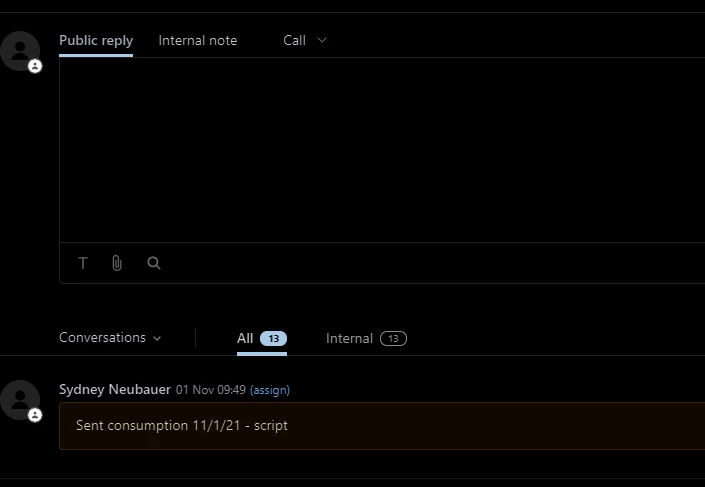
Just a request for improvement - could you find a way to better distinguish between between "Public" and "Internal" messages. While not a big problem, we do find ourselves occasionally unintentionally sending what should be an internal note to a customer.

10 replies

Sydney12
  • July 15, 2021

+ 1 to this request. We have had it where Agents have their brightness high or low and there is a very slight difference between the white and yellow


Heather13
  • July 30, 2021

I'd love to have another layer of private notes - where we can have a private note for just ourselves or just our group but not seen by ALL Zendesk agents.....


Amisha11
  • November 9, 2021

Hi David Richards,  Sydney Neubauer & Heather Rommel - Thank you for taking the time to share your feedback and use cases. It will be helpful to understand more about how we can improve your experience while distinguishing between internal note and public reply. Can you please answer a couple of questions -

1. Do you face this issue on Agent Workspace or Non Agent Workspace or both?

2. Are most of your agents facing this issue? What are some of the situations in which it is difficult to distinguish between the two?

Thanks! Please feel free to include if you have a solution for this issue on your mind.


  • Author
  • November 9, 2021

Amisha - I'm assuming it's Agent Workspace.  We are a small company and the 3 of us who use Zendesk have all done this.  Per my original note, this is a very occasional occurrence and it's not that you can't distinguish between the internal and public it's more a case of human nature taking it's course.  Example, I'm busy - several things on my mind or I'm working on something else (wearing several hats in a small company); support issue comes in which I need help with from a colleague; quickly type what I need and submit having been distracted enough with what I just stopped doing to take care of the ticket that I don't click the Internal note tab and don't remember that Internal note = yellow note background.  Another example, see previous example and take out the distracted part = just plain forget to click Internal note tab.  Maybe a part of this is also that when you submit the reply your eyes are going to bottom right away from the response area so you're not giving yourself a chance to catch the mistake at the last moment.


Amisha11
  • November 11, 2021

Thank you, David Richards. Appreciate the detailed explanation of your use case. We will keep an eye on this thread and update you as we make progress on this ask. Thanks, again!


Sydney12
  • November 12, 2021

1. Do you face this issue on Agent Workspace or Non Agent Workspace or both?

  • We currently face this issue within non-agent workspace but plan on making the conversion soon. And we can see the issue is the same

2. Are most of your agents facing this issue? What are some of the situations in which it is difficult to distinguish between the two?

  • We have had Agents that manage our Tier 2 workflows have accidentally sent internal messages(with Agent full names) publically instead of internally
  • We have Agents that are color-blind and encountered issues with accessibility
  • We have Agents that use a darkmode plug-in which does not translate well in Zendesk
  • When using a screen with a different resolution or brightness, the yellow is almost invisible and you have to rely on ensuring you select "Public reply" vrs "internal note" which has been missed when in a hurry

It would be ideal if Agents could set their own internal note color so that they can tell the difference easier.


  • March 4, 2022

Almost a year later, this remains an issue. I think the (frankly obvious) most simple answer to this UX design issue is that the Internal Notes needs to be primary -- It would be nice if this was the default and the users had the option to switch it if Public being primary was best for their specific profile. -- Edit: This has been included in Zendesk and is no longer a problem -- Thank you Zendesk team!!<3


  • December 19, 2022

I would like the option of disabling internal notes.

Thus forcing/ensuring our requesters get a response,  whilst this does flag some internal training issues, a sticky note or pin would be more useful for internal comments rather than within the same response area.


Heather13
  • March 3, 2023

We're on Agent Workspace @amisha11,

And mainly we want to be able to apply public AND private comments at the same time. Right now whatever we put into a private comment does not get saved if we switch to public comment and hit submit. We want to be able to reply to the customer AND make internal notes at the same time.

We also want to be able to use macros to make the agent do a public comment to the customer and enter some text for our internal notes on the ticket at the same time.


Drew20
  • March 3, 2026

Hi there, 

I would like to express a great deal of frustration with this matter. I cannot fathom why this issue is this old. The UI design relies heavily on a small colour change (yellow for internal, blue for public) and a toggle switch, which is a recipe for human error when you're multitasking or moving quickly.

I already have enough problems updating tickets en masse; slowing down again to make sure the field isn't accidentally set to Public is, honestly, perplexing. Why is it designed this way? This seems intentional and for the life of me, I cannot understand why. Internal notes should be a separate ongoing tally of details, updates, comments and things to keep you working at pace and in flow. 

Please, please, please, change this behaviour. In the very least, offer a more robust “notes” section for primary objects (Users, Orgs, Tickets). As someone who built their own ticketing system using a no-code, low-code solution, this was a primary design choice and worked extremely well for my team. Happy to discuss and offer further input, the sheer fact that the SAME text box is used for two different features is absolutely mind-boggling. 

It’s like putting the "Eject" button and the "Interior Light" switch on the exact same toggle. You’re just trying to see where you dropped your pen, but because you didn’t double-check a tiny LED indicator, you’ve suddenly launched yourself through the roof.