Hello,
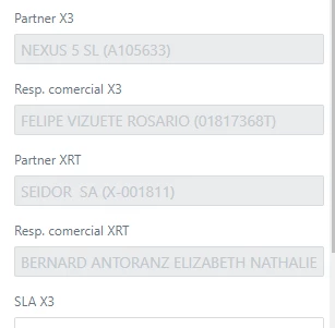
when the agent has read-only permissions in the organisation area, the fields are greyed out as they are disabled. This means that, as the text colour is grey, there is very little contrast and it is difficult to read the data.
For an agent, who spends many hours a day in front of the information, this is detrimental to his eyesight, as it forces him to strain his eyes to read the data.
Ideally we would like to be able to customise the whole style, but in the meantime, or not, could you make any changes to make it more contrasting and easier to read?
Regards
pd: An example of the organisation area with the agent view: