One of our agents recently had issues changing the requestor from a missed call to an email address for response. They noted afterwards that the change link next to the requestor in the ticket was a little too subtle for them to notice. I would have to agree, and I am worried a lack of contrast does raise accessibility issues as well. Would it be possible to add a little contrast to the button so it stands out as an option a little more?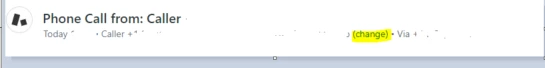

Idea Submitted
Change Requestor Link Too Subtle
Login to the community
No account yet? Create an account
Enter your E-mail address. We'll send you an e-mail with instructions to reset your password.