
The original tip was posted by Wes. I am simply updating the tip to make it work with the current theme version.
Let gets started without any further delay.
Demo: https://moderatortrapta.zendesk.com/hc/en-us
Step 1: Add the below code (HTML CODE SNIPPET) to the source code of your article.
<div class="accordion">
<p>Section 1</p>
</div>
<div class="panel">
<p>Lorem ipsum dolor sit amet, consectetur adipisicing elit, sed do eiusmod tempor incididunt ut labore et dolore magna aliqua. Ut enim ad minim veniam, quis nostrud exercitation ullamco laboris nisi ut aliquip ex ea commodo consequat.</p>
</div>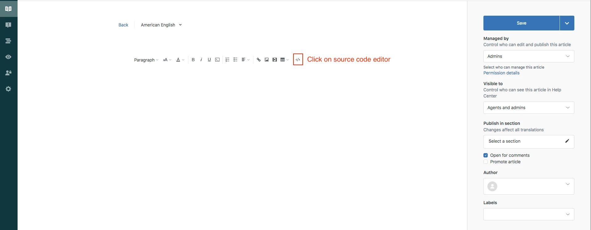 Click OK to save the progress.
NOTE: You can copy and paste the same snippet to add as many accordions as you want.
Step 2: Edit your theme to add the below code at the bottom of your style.css file
.accordion {
  background-color: #eee;
  color: #444;
  cursor: pointer;
  padding: 18px;
  width: 100%;
  border: none;
  text-align: left;
  outline: none;
  font-size: 15px;
  transition: 0.4s;
  margin-bottom: 10px;
}

.accordion p {
  display: inline;
}

.active, .accordion:hover {
  background-color: #ccc;
}

.accordion:after {
  content: '\002B';
  color: #777;
  font-weight: bold;
  float: right;
  margin-left: 5px;
}

.active:after {
  content: "\2212";
}

.panel {
  padding: 0 18px;
  background-color: white;
  max-height: 0;
  overflow: hidden;
  transition: max-height 0.2s ease-out;
}
Step 3: Edit your theme to add the below code at the bottom of your script.js file
document.addEventListener('DOMContentLoaded', function() {
  var acc = document.getElementsByClassName("accordion");
  var i;

  for (i = 0; i < acc.length; i++) {
    acc[i].addEventListener("click", function() {
      this.classList.toggle("active");
      var panel = this.nextElementSibling;
      if (panel.style.maxHeight) {
        panel.style.maxHeight = null;
      } else {
        panel.style.maxHeight = panel.scrollHeight + "px";
      }
    });
  }
});
Save and publish the changes.
YOU CAN USE THE ABOVE CODE TO ADD ACCORDION ANYWHERE THROUGHOUT THE THEME. YOU NEED TO PASTE THE HTML CODE SNIPPET (IN STEP 1) IN RESPECTIVE TEMPLATES WHERE IF YOU WANT TO ADD IT ANYWHERE OTHER THAN THE ARTICLE TEMPLATE.
Let us know if you face any issues.
Thank you
Thanks