Hello, Zendesk Community!
We're happy to announce enhancements to our Help Center (support.zendesk.com). The changes are directly based on feedback that you have provided in an ongoing survey that appeared throughout the Help Center.
Here are the top themes we’ve heard from you in the survey results:
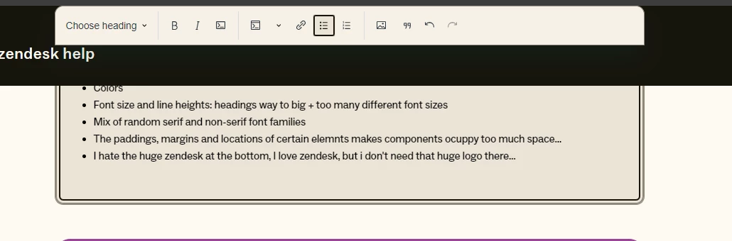
- Content variety: more video and multimedia, more practical guidance for specific use cases, and less unnecessary Zendesk jargon.
- Better search functionality: there’s a lot of content in the Help Center and our current filtering, scoping, and sorting options aren’t enough to get you to the right information fast.
- Improved knowledge based structure: a browsing experience that focuses on the tasks you’re trying to accomplish in Zendesk and your needs at various points of your Zendesk journey.
-
Understanding relevance: What you can do with Zendesk varies based on your plan level, role, and other attributes, so it can be hard to know whether a Help Center resource is relevant to your specific account or plan.
Here’s a quick preview of what to expect:
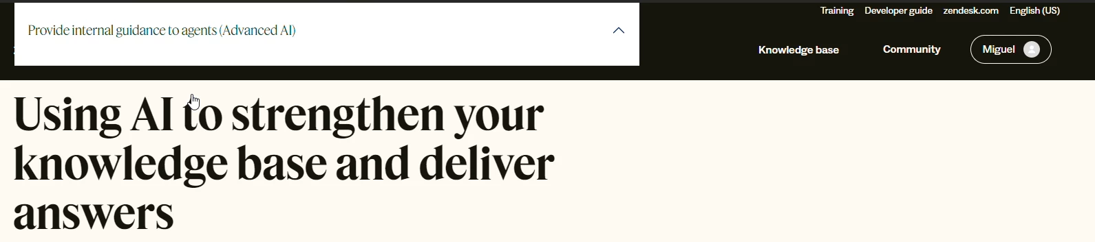
- A refreshed design - The Help Center sports now a new look, still built on Zendesk Guide, but with a more streamlined, user-friendly interface.
- An improved browsing experience - We reorganized our content structure to make it event easier for you to locate and understand the content you need, quickly and effortlessly.
- An enhanced search results page - When you search in our Help Center, you are able to filter and scope your search results by additional facets. You’ll also be able to sort results based on additional attributes like date published or most upvoted.
It’s worth mentioning that your favorite features and content will remain intact. The aim is to make your experience better, not alter the core information you rely on.
Join the conversation
We invite you to participate in the ongoing discussion in the comments below. Your satisfaction remains our top priority as we continue to improve and adapt together.