All,
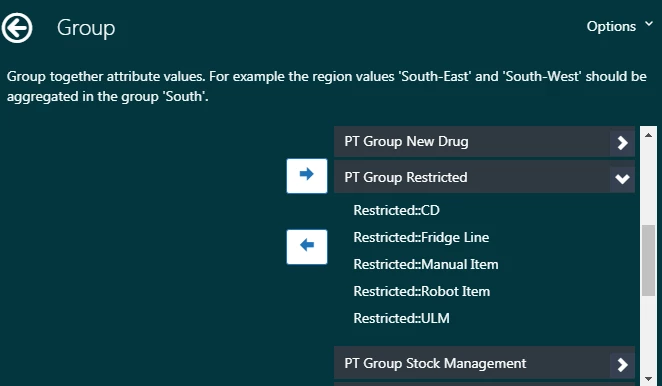
I've searched the community and can't find how to do this. I have multiple categories and subcategories for tickets:

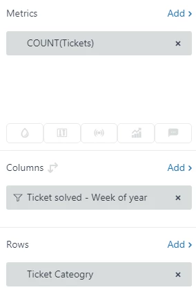
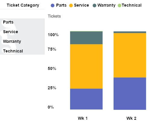
I have grouped these into their main categories and am trying to use them to drive a stacked chart with only the 4 main categories. Something like this mockup I put together:
But what I end up with is this:
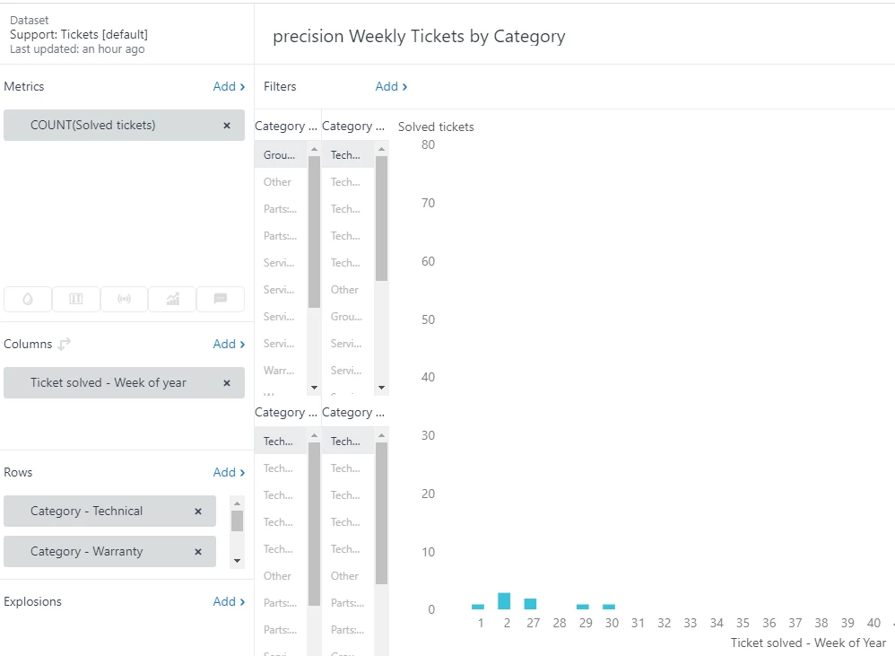
Any idea how I can use the grouped categories to drive a simple chart that only has the 4 main categories? Your help is much appreciated.
- John Ritter
- Troy, MI