
Hei,
I searched but could not find an answer (or I was not good at searching).
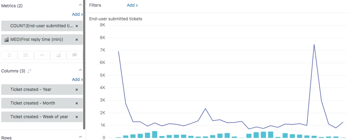
Here I have a chart where I wish to compare the average first reply time Vs the number of tickets received.
The issues are:
1) on the left of the graph I should have the Y values for "tickets submitted and on the right side of the graph I should have the Y values for "MED first reply time"
2) by doing step 1, in the graph the maximum height of "tickets submitted" (0 to 600 tickets) should be similar to the maximum height of "MED first reply time" (0 to 7500 minutes) since the two information are not related and two different value types.
Thank you for your support!