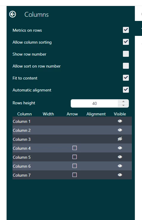
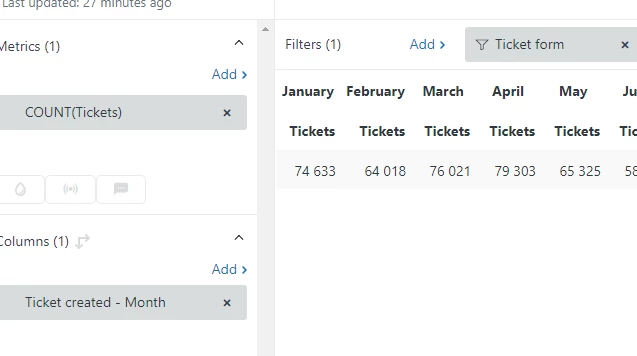
Is it possible to hide the Metric label when the color legend is disabled? In this case, the word "Tickets" appears after every category. It seems a bit redundant in this visual, but I suppose it may not be possible without affecting all of the other chart types. A table visual with the month in the columns will have a 2 level header - month on top and the word tickets below it. Both visuals would be cleaner without this behavior.
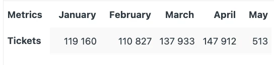
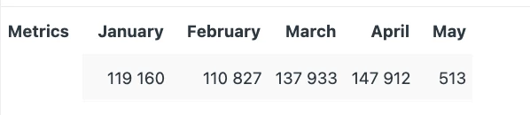
 Now the "Row Header" for Tickets is invisible, and only the top months remain: