
Im trying to create a report to show the % SLA achievement rate by priority month over month. I want the x axis to have the months (ticket created date), the y axis should have the %, and then lines to indicate each priority (low, normal, high, urgent). I have a report created but the priorities are separated into their own graph but I want these to be combined in one graph. I think I need to create a standard calculated metric for priority in order to achieve this. This is the formula I tried to enter but I'm getting an error and I can't figure out how to fix it. Can anyone help me with this?
IF(
[Ticket Priority Value] = 'low',
1,
IF(
[Ticket Priority Value] = 'normal',
2,
IF(
[Ticket Priority Value] = 'high',
3,
IF(
[Ticket Priority Value] = 'urgent',
4,
0
)
)
)
)
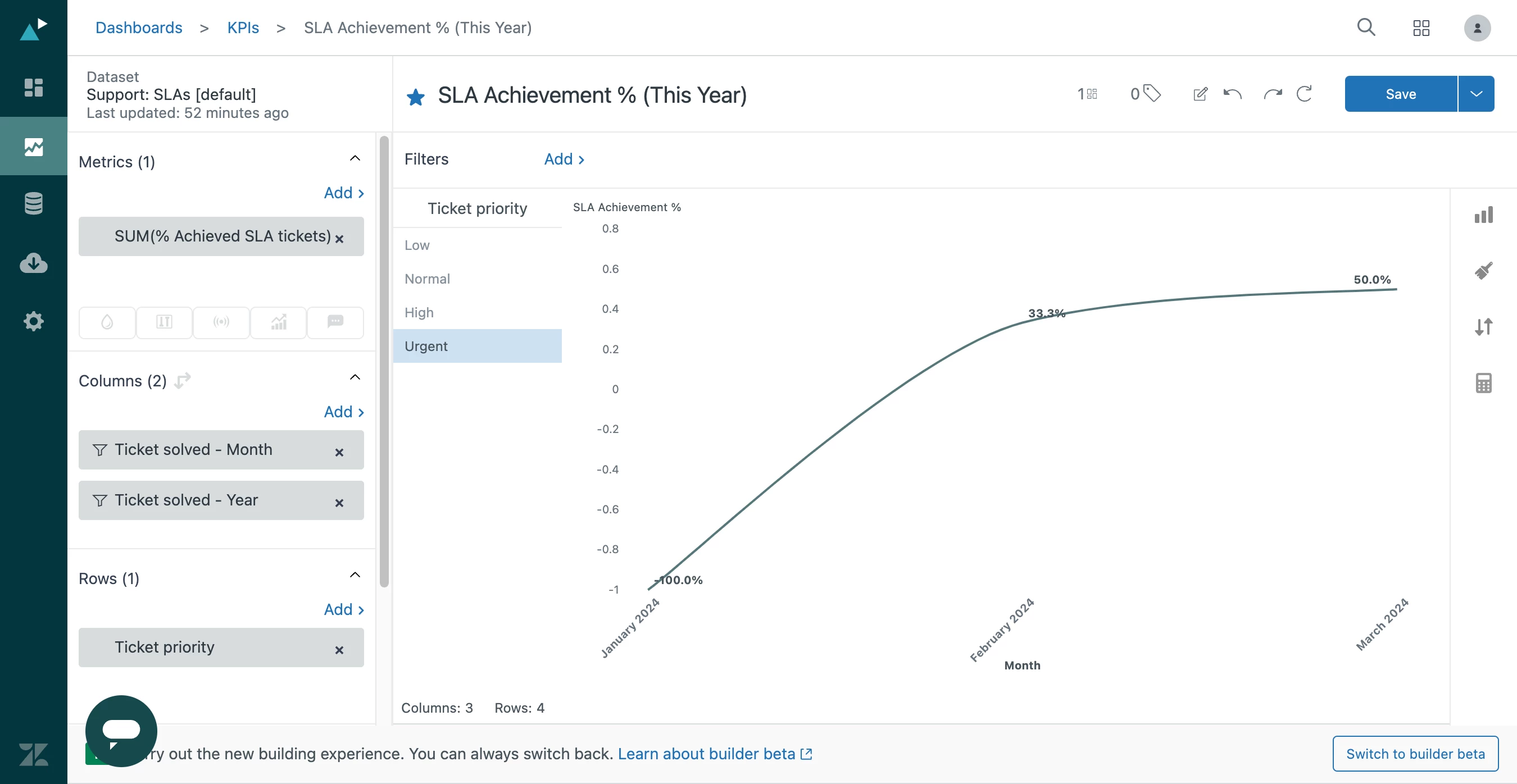

I hope you're doing well! It seems like you're interested in generating a report that resembles the one shown in the image.
Is that correct? If it's not what you're looking for, please inform me, and I'll be happy to assist you further.