Hello,
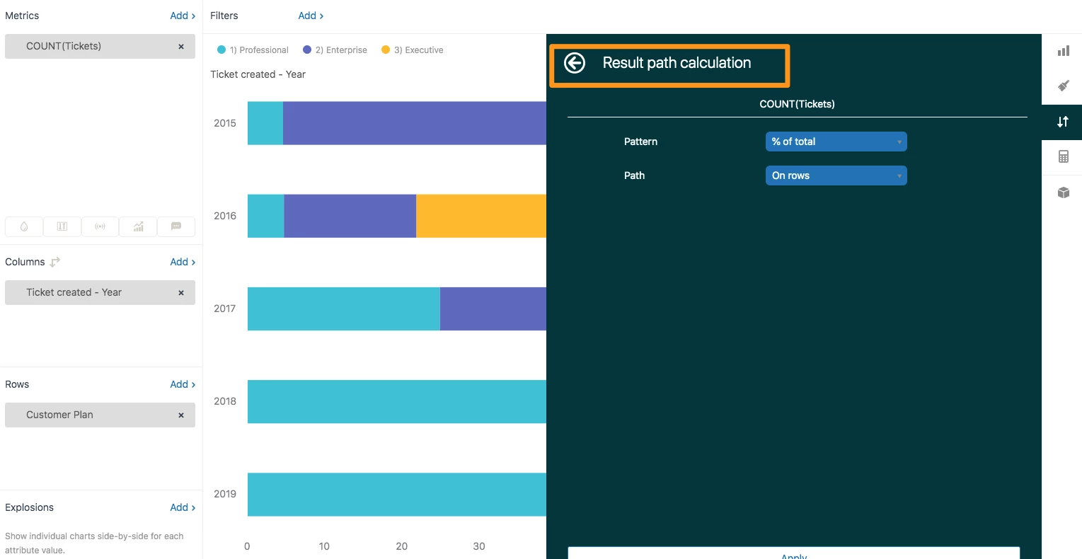
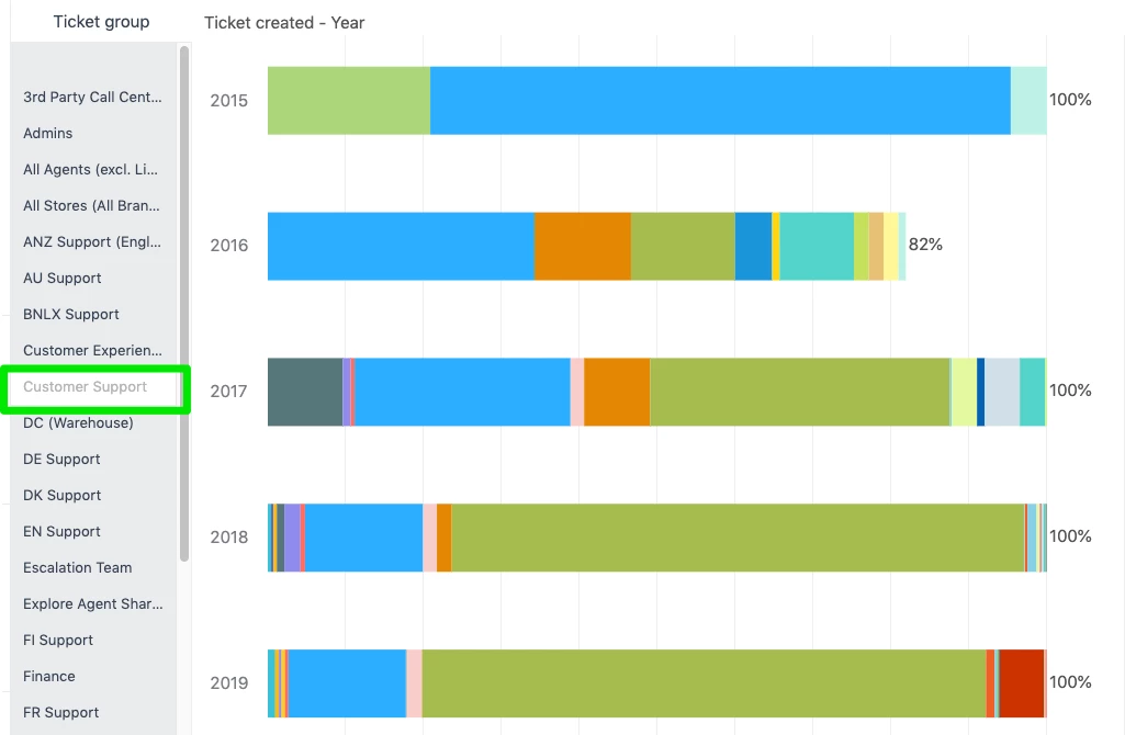
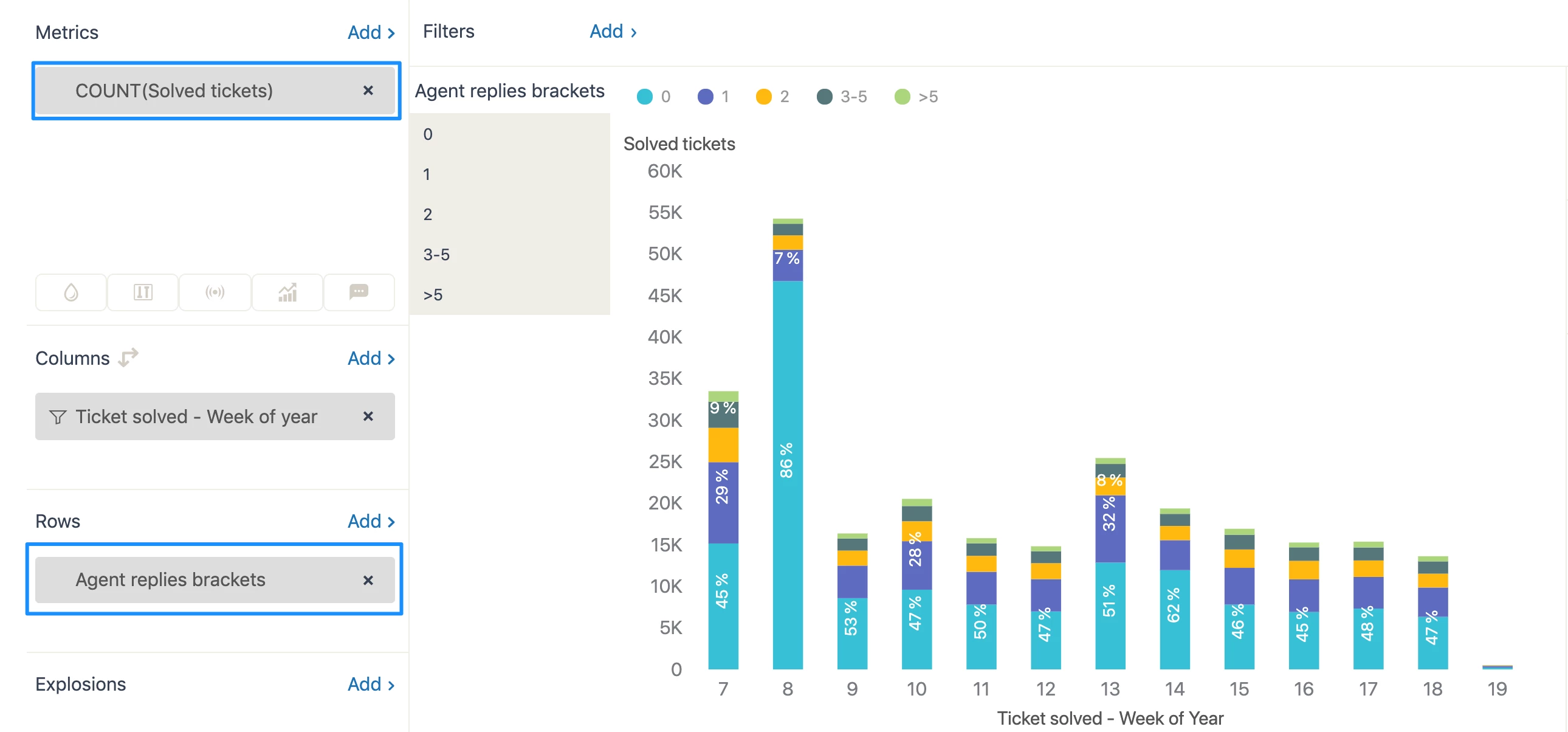
I'm trying to set up a stacked bar chart where every column/row adds up to 100%, in order to visualize proportions. I want to compare the percentage of tickets we get by Product Module (custom field of ours). However, I can't find any options to do so, neither in x-axis nor y-axis options in the Chart Configuration sidebar. See below for an example.
Any help would be appreciated!
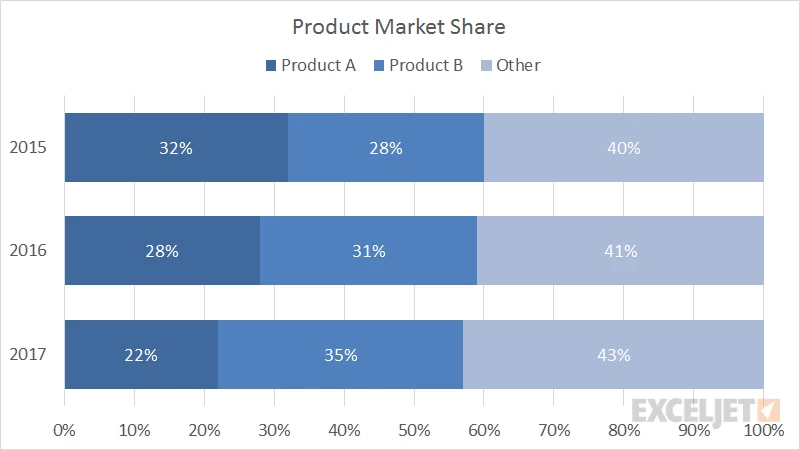


 Demo:
Demo: