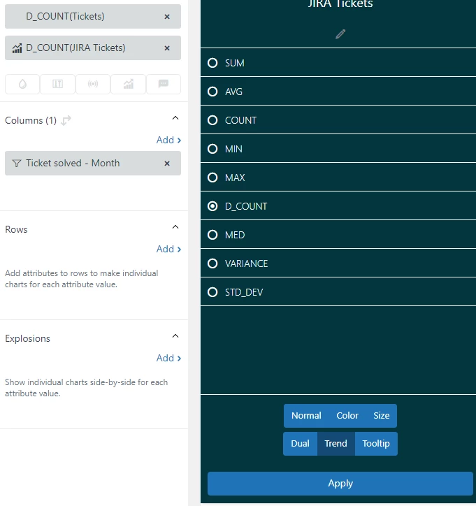
Insights previously had the ability to add combo charts:
https://support.zendesk.com/hc/en-us/community/posts/360034835654-Chart-Combo?input_string=Combo%20charts
Example: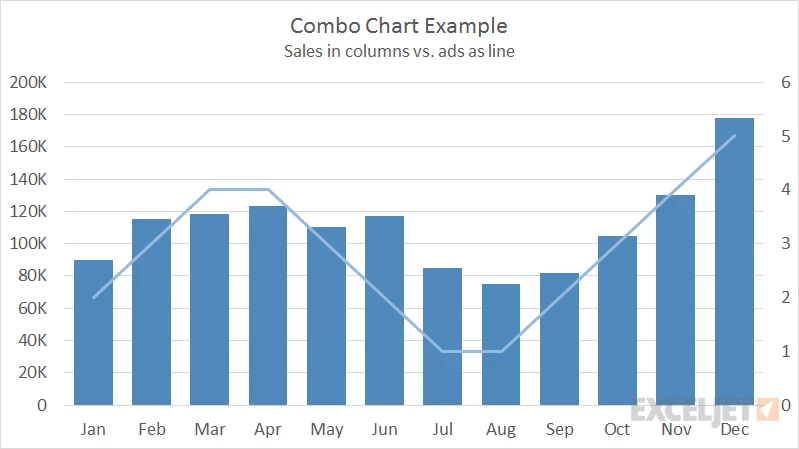
I'm trying to consolidate all of our support reports into Zendesk. The one thing that can't be done is combo charts, which are valuable for showing the correlation between two datasets. For example, showing a bar graph of tickets created vs a line showing time to solve is a great way to visualize the relationship between those two datasets.