Average trend vs monthly breakdown | Community
Skip to main content

Average trend vs monthly breakdown

  • June 2, 2021
  • 3 replies
  • 0 views

Hi there, 

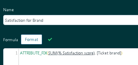
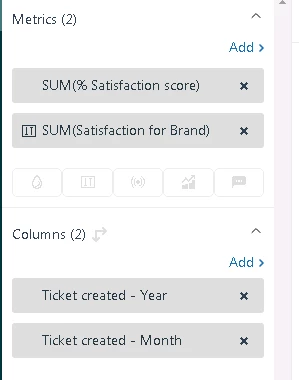
Our agents ask often whether it's possible to compare average Satisfaction Score for last 12 months vs monthly Satisfaction Score. Ideally it would look like: bar chart of 12 months Sat score by month (12 bars) AND have the average 12 months Sat score trend line across the bars. 
Tried different scenarios but none of them exactly works like we want it. 

If anyone could help with that it would be very much appreciated. 


3 replies

ZZ55
  • June 14, 2021

Vlandimir

You can add a trend line to a column Chart Configuration>Trend Line, then choose the Linear option. 

Or use  the new aggregate functions. For that to work you need some high level attribute to calculate your overall figure- such as ticket group or brand.

Add your new metric to your query, then click it and select the Dual option.

So you will have something like this:


  • Author
  • June 15, 2021

Thanks for this @Graeme Carmichael 


I'm not sure I understand the 'brand' bit. I've tried to set up a query following the example from the article that you've shared, but can't get it working. I've asked the question there, hopefully will hear back. 


ZZ55
  • June 16, 2021

Vladimir

Perhaps there is a better way of doing it. But the aggregate function needs a second parameter. You could use ticket group instead if you are showing your satisfaction rating per team.